Parallax effect in web design means the displacement or difference in apparent location of an object when viewed along different sight lines. Parallax scrolling, then, is an effect where the background images move slower than the foreground images. In practical terms, it means the website loads as you scroll down or across, creating the visual sense of a story unfolding before your very eyes.

Table of contents
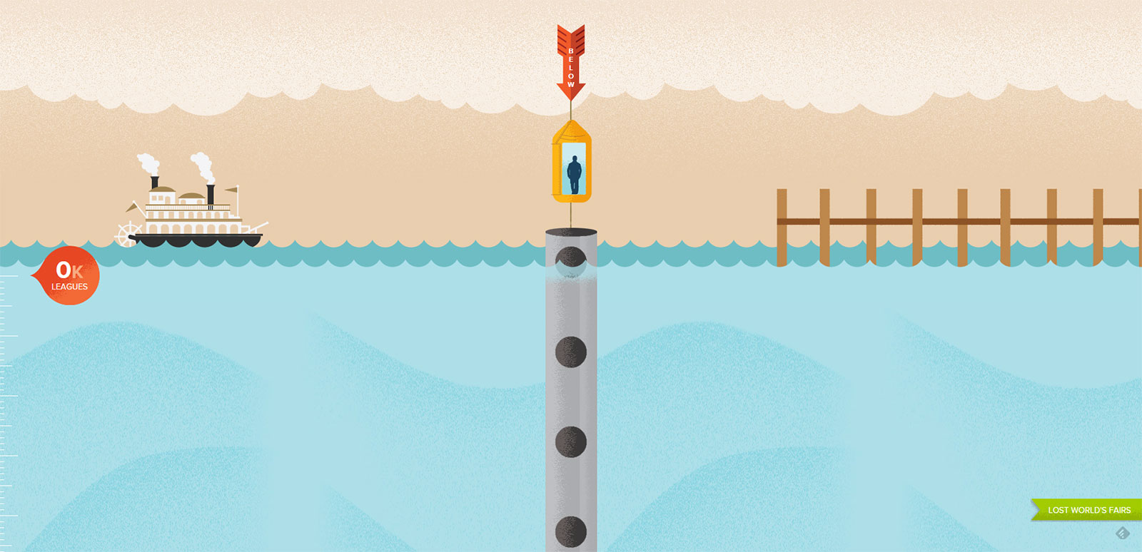
Why is parallax scrolling used?

Image source: loisjeans.com
When it was first invented, it was very popular, but like most trends, it wasn’t necessarily a good idea. Parallax effect in web design, like disco or hammer pants, feels fun and exciting, of course, but it doesn’t necessarily have the greatest function nor the greatest longevity.
Scrolling for the next element in parallax-designed websites feels like an accomplishment, and it can be exciting to see the content unfolding in front of you. It works extremely well for websites that are trying to sell an idea or for those websites that are really only meant to be viewed once, like personal sites or portfolio style sites that just want to showcase photographs and maybe a little bit of information.
It’s also very enticing for the website developer; people love designers who can pull off an impressive site. The interactive elements that can be integrated into parallax can be stunning. At first glance, parallax websites certainly do astonish and amaze. However, overusing parallax scrolling can lead to some problems.
Also read: How User Experience Plays A Significant Role In Premium Websites
The Long Haul

Image source: costa.co.uk
First and foremost is that parallax scrolling takes a huge amount of load time, comparatively at least. Modern users demand that sites load almost instantly, and parallax just can’t deliver. Parallax effect in web design is not known for its speed, more for its eye-catching effects, and if you want your site to be one that people use often, forcing them to wait for it to load will more than likely annoy them away and off your site before they get to the content you want them to see.
Think of the sites that people use most often – Google, Amazon, Gmail, Wikipedia, Facebook, etc. Because users are meant to visit these sites, again and again, load time and server load are optimized, whereas parallax sites sacrifice speed for visual effect. Parallax, no matter how it’s utilized, will inevitably cause your load time to suffer, at least to some extent.
You must balance the positives of using parallax versus possibly having load times so slow that website traffic drops off precipitously and your search rank is compromised. A fancy scrolling effect really isn’t worth such negative impacts, after all.
Check out this blog for an in-depth look at web design basics.
Use and Value of Parallax Effect In Web Design

Image source: flatvsrealism.com
People that have less-powerful computers or slower internet connections may not be able to access sites that use parallax scrolling at all. They create such a heavy burden on the computer, that those who are not tech-savvy may not be able to load the site at all, which obviously eliminates their ability to interact with the content in any way, much less a meaningful way.
As long as your target demographic is likely to keep up, then you’re probably fine, but keep in mind that you may be alienating others that might have become potential visitors or customers. Even if your audience is technologically competent, it’s easy for parallax websites to become extremely confusing very quickly.
Users can easily become lost trying to find information if your website is too confusing, scrolling through endless pages of flashing graphics without much content, or pages so content-heavy they can’t find what they need. They don’t see a story unfolding pleasantly before their eyes; instead, they see themselves falling down a rabbit hole.
Parallax works well if your website is just a landing page, like a slideshow or some quick information about who you are and how visitors can get in contact if they want more information. For those kinds of websites, it works extremely well, and the visual engagement factor works to your advantage.
However, for websites designed to give information or promote a deeper understanding of your business or service, parallax scrolling often falls short. Visitors can easily become confused and either not actually get the information you were hoping to pass along, but possibly leave the site altogether and turn their business elsewhere.
Parallax scrolling websites might also work for sites aimed at children. It can be very interactive with lots of brightly colored animated graphics and kids would delight in finding the ‘secret’ places to click to trigger movements or special effects.

Image source: britishlegion.org.uk
However, it’s easy to see how quickly adults would tire of this, and just want the information they were looking for in the first place. Parallax websites are often impressive at first glance but pale in comparison to the actual function.
Also read: Best Free Graphic Design Websites for Students
Parallax and Mobile
Put simply, parallax scrolling doesn’t work on mobile devices, really at all. As more Americans primarily use the web on mobile devices, it doesn’t make much sense to have a website that can’t even be accessed by pinch and zoom. When deciding whether or not to use parallax scrolling in your website, consider whether your customer base is likely to be using their mobile devices to access your site.
If they are, it’s best to consider another option and ensure that your site is mobile friendly as well. Even websites designed very well for monitor viewing can fall flat if the mobile site is subpar, which drives away visitors.
The SEO Road

Image source: Keneth Von Rauch
SEO, or search engine optimization, is increasingly important. Most people don’t look past the first result or two on Google, and much less the first page. Keywords and speed calculate search engine results, both of which put parallax at a disadvantage. Because most parallax sites are a single page, there isn’t a lot of space for web designers to embed keywords, which helps with SEO.
Additionally, parallax sites are inherently slower because of the clunky code required, which pushes your site down in search results. Also with parallax sites is the issue of no internal links; the bounce rates are incredibly high because there is quite literally nowhere else to go within the website itself. Linking additional support pages off the main parallax home page helps to build more content and therefore increases the number of keywords.
Also read: Best Ways to Boost Customer Engagement in Your E-commerce Website
Parallax Scrolling Out of Favor

Image source: makeyourmoneymatter.org
So why did parallax scrolling lose its hype? For one, it uses Javascript, which makes page load types abysmally slow. The script must calculate every time even one-pixel moves, which place an almost unbelievable strain on the system.
The parallax effect is hard to implement and in the end nearly useless on subpar computers and slow internet connections, which are a fact of life for many people. Why make your site inaccessible to a large group of people? It just doesn’t make much sense.
Additionally, parallax doesn’t work in most cases on mobile devices. With increasing percentages of traffic coming from mobile users, either on tablets or smartphones, it doesn’t make logical sense to alienate those people and make your site unusable.
Some sites have tried it, by integrating swiping into their site for a parallax-like effect, but those sites generally load extremely slowly and many users grow bored before they interact with all of the content.
Finally, even for optimized monitor viewers, scrolling can grow tiresome. Certainly, not all of the information needs to be right in your face on the splash page, but having to scroll through pages and pages of animation just to reach vital information is a waste of time and energy.
The point of creating a website is to engage viewers, possibly turn them into customers if it’s a business website, and generally give them information about your product or service. Why would you intentionally design your website to counteract those very worthy goals?
Also read: How to Avoid Web Content Plagiarism on Your Website
A Solution Within Reach
Now that we’ve discussed the problems with parallax scrolling, it’s time to start brainstorming a solution. The best resolution is most likely to feature parallax on the homepage, and link to non-parallax pages elsewhere within the site. This increases keyword optimization, and the non-parallax pages can hold the lion’s share of your supporting content. This helps with problems of both load time and SEO optimization.
And finally, ensure that parallax scrolling is really worth it for your website. It’s only worthwhile if it drives the story forward in a meaningful way. And connects with the majority of your viewers in a way that traditional page design wouldn’t. Also, consider where your traffic comes from. If most of it is mobile-based, you may want to consider a different option. Remember, the point isn’t to impress other designers, it’s to make a functional website.
Ultimately, the purpose of a website is to get visitors to interact with your content in a mutually beneficial way. If flashy parallax scrolling is the best way for you to get there, then by all means, design to your heart’s content. But for most people, either using parallax sparingly or not at all is more likely the key to success. Use your common sense and don’t allow swirling, flashing, interactive websites to hypnotize you.
Credit for featured image: lostworldsfairs.com
Like this post? Check out more amazing web design content here.


