Readability and legibility are crucial to a website’s success. Many resources attempt to define what makes a website legible or well designed. This post will discuss typography tips & some design factors that contribute to making a website legible.
WCAG 2.0 recommends some ways to make web content accessible to readers. Not all readers love the looks WCAG recommends. Still, the guidelines seem to be useful for most people; the effect they produce may not be what everyone considers “beautiful” but it is legible.
If not properly designed, reading the screen can be painful to visitors’ eyes. They squint from the glare while straining to focus on the words. You can reduce the pain, however, by reducing the number of text visitors need to read at a time. Breaking up text into small sections and choosing the right font, color, and size can make a website much easier to read.
Table of contents
Typographic Patterns
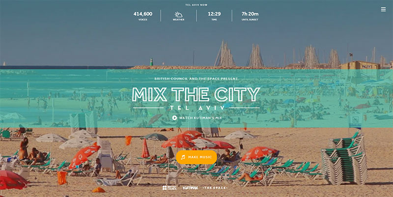
Image source: mixthecity.com
Good typography design presents a satisfying level of contrast between type fonts, between paragraphs and headings, and with the surrounding white space. Readers’ eyes are automatically attracted to contrasts and patterns. A website that looks like a solid wall of type may block readers’ brains from understanding the content.
Just making the type bigger is not enough to make it attractive or readable. Even bold type won’t attract readers’ attention if everything is bold. Text can be informative and professional and still be displayed in a format that is physically easy to read.
Typography adds patterns on a page that is primarily text. Before readers read words and recognize titles, they see the patterns of text and headers. When these patterns are regular and systematic, they help readers understand the ideas the text presents. When the patterns are chaotic, they confuse readers.
If one line or paragraph looks different from the next one, the difference should have some meaning for the reader. Headings need to stand out; paragraphs that present the same level of information need to look alike. Breaking this rule makes it harder for readers to find information on the page. It is essential to follow these tips for typography.
Also read: How To Use Large Web Typography To Stand Out
No Fine Print – Typography Tips
One of the best typography tips. Print designers can print text with a high resolution (150 to 300 dots per inch) that allows small details to print clearly. Many people can read the fine print on paper, as long as each tiny letter is clear. On a computer screen, the highest resolution that’s usually possible will be 72 pixels per inch, which leaves room for fewer small details to display.
Check out this ultimate guide to the basics of typography.
Margins and White Space
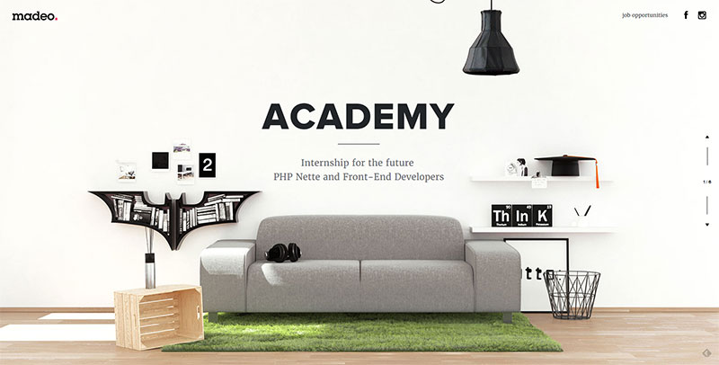
Image source: madeo.academy
This is yet another one of the best typography tips. Margins define the reading area on a page by separating the text from the surrounding environment. While margins are an important part of the design of any printed page, margins are especially important on a web page, where the text has to coexist with browser icons, windows, menus, and other elements that display on the reader’s computer screen.
Consistent margins provide consistency and unity throughout a website. White space, the “negative element” of blank space that surrounds, separates and defines “positive elements” of text and images, is an important part of graphic design.
On a web page, the white space tells readers where to look for information and navigation tools. Wider margins around narrower chunks of text may be used to identify quotes or replies; pieces of text that come from the same source should have the same margin spacing. It is important to follow these typography design tips.
Also read: Typography Visual Hierarchy And What It Means
Justified Text
Justified text appears as solid rectangular blocks with even left and right margins. Headings are usually centered between sections of justified text. The first line of a paragraph is usually indented, and the last line may be short. Printers achieve this effect by adjusting the spacing between words and hyphenating long words.
While the justified text is the way English readers learn to expect paragraphs of text to look in books and magazines, it can be hard to achieve on a website. Shorter lines and larger type tend to force the justified text to display with extremely irregular word spacing, which looks messy and distracting to readers. Although modern browsers will support justified text, a lot of manual correction is still necessary to allow justified text to look good on a web page. These typography tips and tricks will elevate your overall website.
Also read: How To Design A Website With Great Typography
Indenting Paragraphs – Typography Tips
There is still some controversy about indenting paragraphs.
Traditionally, in printed books and newspapers, there is no blank line space between justified paragraphs. The first line of each paragraph is indented to separate it from the previous paragraph, in case the last line of the previous paragraph was not short enough to introduce the new idea or speaker to readers. This style allows more lines to be printed on a page. It is still the style many readers expect to see in a “finished, edited” book, newspaper, or magazine.
On websites, paragraphs are usually separated by a blank line and not justified. Online readers are familiar with database and e-mail systems that don’t support indented paragraphs and have learned to recognize a blank line as a paragraph break. When unjustified paragraphs are separated by white space, indenting the first line may seem unnecessary or even confusing.
However, either paragraph style is acceptable, as long as it is consistently applied throughout the page.
Also read: Typography: The Importance Of Getting It Right
Custom Fonts
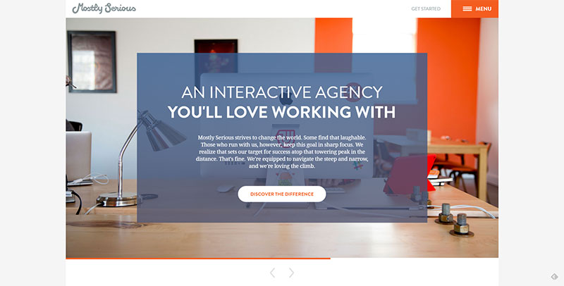
Image source: mostlyserious.io
With a growing number of web fonts to choose from and new ways to implement fonts onto sites using CSS instead of Javascript or Flash, some foundries are selling licensed “custom fonts” to help define a specific brand image. While “custom fonts” appeal to website designers for many reasons, they may not display legibly on a different device. Currently, it’s still advisable to use common fonts that will display well on website visitors’ computers.
CSS “Text-Rendering” Property
This is a new CSS feature that not all browsers will support. Currently, text-rendering can be used to enhance legibility in Webkit and Firefox 3. Setting this property’s value to “optimize Legibility” can enable ligatures and enhance kerning in type. In the future, CSS “text-rendering” is expected to enhance the geometric precision of “rendered” type.
Line Length – Typography Tips
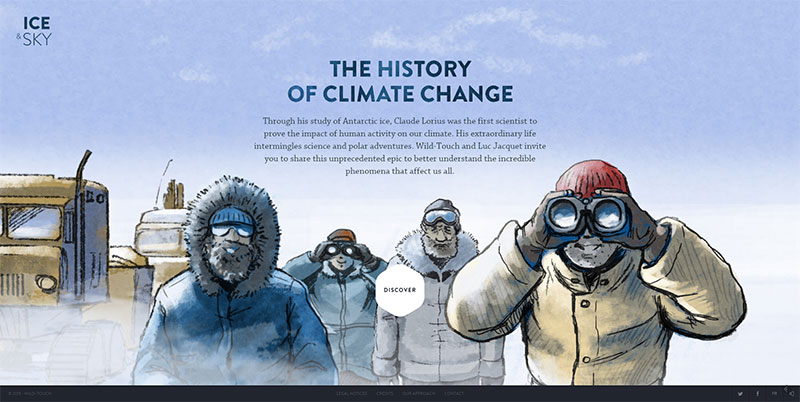
Image source: education.iceandsky.com
Most readers’ eyes can focus closely on only three or four inches of space at one time. Magazine publishers try to present information in columns that are three or four inches wide, or narrower. For people accustomed to skimming quickly down three-inch columns, lines of text that run all the way across a computer screen can be difficult to read; their eyes “get lost” on the long trip back from the end of one line to the beginning of the next line.
A fixed layout can restrict the length of lines of text on a website. Of course, different browsers, and users’ ability to adjust the screen to “zoom in” on text may change the effect readers actually see. However, a line length of forty-five to seventy-five characters is traditionally considered ideal for legibility.
Why do some websites demand that readers read lines of 150 characters or more, spread all the way across a ten-inch screen? Site designers may be trying to pack as much information as possible onto the screen so that it can all be seen at one time, forgetting that it may not be read. They may be simply copying a format that worked on a printed document onto the website. Or they may be in the minority of readers who see even less than three or four inches at a time, aren’t able to skim down columns, and have trained their eyes (or hands or ears) to process text in some alternative way.
The trouble with displaying long lines of text on the screen as it first opens is that it will be difficult for many readers to see, read, and use that information. On a computer screen, 450 pixels is sometimes considered the maximum line length that allows readers’ eyes to zigzag comfortably down the page. At 72 pixels per inch, 450 pixels per line will be a compromise for those who can read most comfortably by skimming down three-inch columns.
Also read: Learn The Difference Between Typography And Lettering
Color
Image source: welcomespring.be
Typically, dark-colored text on a light-colored background is easier to read than light text on a dark background. A dark, muted color (gray, brown, blue) can give a softer effect than flat black on white. A pale, muted color can likewise give a softer effect than a stark white background. If you want a lot of text to be read, it’s best to stick with dark text on a light background or a light text on a dark background. One can get the best outcomes by implementing these typography tricks.
Leading – Typography Tips
Try widening the space between lines of text (the leading) to improve your website’s legibility. Lines of text that are too close together look crowded and may be difficult to read. Lines that are too widely separated can look like a graphic rather than a paragraph. The right amount of leading makes a paragraph look coherent but not crowded.
Also read: The Best Strategies For Achieving Typographic Hierarchy
Accessibility to Alternative Readers
A surprising number of people who use the Internet won’t be reading your website in the usual way at all. Some people “read” websites by printing the text onto paper. Quite a few use devices that “read” text aloud by converting the words onto screen into pre-recorded sounds.
Choosing common fonts and simple formatting will make your website accessible to these readers. If your website is all about video images, it may not need to be accessible to people who don’t look at a computer screen. Otherwise, you may want to consider printability and scannability as part of your site’s legibility.
Think Legibility
In order to be useful and informative, a website must be legible. Keep legibility in mind when you’re designing a website that readers will visit, use, and come back to!
Credit for featured image: jhopenstand.ch
Like this post? Check out more amazing web design content here.
