Are you looking to learn about WordPress Logo and its evolution in detail?
This article will help you get covered!
The WordPress logo is more than a brand symbol. It represents the platform’s evolution, values, and worldwide reach. Since its inception in 2003, WordPress has grown into the world’s most popular content management system, powering over 40% of the web.

However, continuous changes and iterations have been introduced with time, marking the modernization of the logo. This article will explore in detail the crucial changes made in the logo of WordPress throughout history.
Remember to read through till the end!
To know more on WordPress you can further read: What is WordPress?
Table of contents
What is a WordPress Logo?
The WordPress logo is a sleek, minimalistic design that embodies the platform’s essence.
At its core is the iconic “W” emblem encased in a circular frame. This design has become a universal identifier for WordPress, symbolizing the platform’s reliability and prominence.
Its simple yet powerful design reflects WordPress’s commitment to accessibility, functionality, and user-centric innovation.
What Does the WordPress Logo Represent?
The WordPress logo is more than a visual mark; it represents the platform’s identity, mission, and values. Here’s what it signifies:
- Platform Evolution: The WordPress logo symbolizes the platform’s journey from its inception to becoming the world’s most popular CMS. Its design reflects the adaptability and continuous improvement that have driven WordPress’s growth and success.
- Global Reach: As WordPress powers over a huge chunk of the website, the logo represents its widespread adoption and influence in the global digital landscape. It stands for a community of users, developers, and contributors who drive innovation and collaboration.
- Values and Principles: The logo’s simplicity and elegance mirror WordPress’s core principles: user-friendliness, accessibility, and open-source philosophy. It embodies the commitment to providing a free and open platform for everyone to create and share content.
- Recognition and Trust: Over the years, the WordPress logo has become a mark of quality and reliability. It is instantly recognizable, signifying a trusted and robust platform that powers millions of websites worldwide.
As we delve deeper into its evolution, we will uncover the significant changes that have shaped its identity.
Also read: 12 Worst Logo Redesigns That Missed The Mark (and Why)
History of WordPress Logo
Since its foundation, the WordPress logo has undergone several changes, reflecting its growth and commitment to innovation and community.
Here’s a look at the significant milestones in its evolution
1. 2003 – 2005: Introduction of WordPress
The journey of the WordPress logo began with the platform’s launch in 2003. At the time, WordPress was still in its infancy, and the logo reflected the project’s simplicity and grassroots nature.
The earliest iteration of the logo symbolized the platform’s open-source philosophy and user-friendly ethos. It was a straightforward design featuring the letter “W” in a serif font enclosed within a circular emblem.
The logo is minimalistic, but its simplicity is intentional. It emphasizes clarity and focus. Created by Matt Mullenweg, founder of WordPress, it aims to resonate with the growing user base.
WordPress Logo Font Between 2003-2005
The font used in this early design was serif, lending the logo a classic and professional look.
This choice was strategic, conveying trust and reliability while aligning with the platform’s mission to provide a stable and innovative content management system.
Other Specifics:
- The color scheme was primarily monochromatic, which kept the design clean and easy to reproduce across different media.
- The early logo’s simplicity also reflected the minimalist design principles of WordPress as a platform: it was easy to use, functional, and accessible to all.
While this initial design was well-received, it left room for improvement as WordPress evolved.
2. 2006 – 2007: Refining Identity
As WordPress gained popularity and expanded its community, the need for a more polished and professional logo became evident.
By 2006, the WordPress team had begun refining the initial design, making it more versatile and representative of the platform’s growing influence.
In this phase, the WordPress logo underwent significant changes to establish a stronger brand identity.
The “W” emblem was introduced as the focal point but redesigned with improved symmetry and aesthetics. This iteration aimed to balance simplicity with sophistication, appealing to a more diverse audience.
WordPress Logo Font Between 2006-2007
One key update was the introduction of a custom typeface for the “W,” ensuring the logo had a distinct and recognizable appearance.
The serif styling of the letter “W” was enhanced, making it more elegant and visually balanced within the circular frame. This refinement also addressed early concerns about legibility and consistency across various formats.
Also read: Disney Logo Evolution: How The Iconic Logo Grew Alongside Our Favorite Films
Other Specifics:
- The enclosing circle was perfected to achieve a uniform and harmonious design, emphasizing the cohesive and inclusive nature of the WordPress community.
- A darker blue-gray shade for the logo’s primary color was introduced, departing from the earlier monochromatic scheme. This change added depth and professionalism to the design while retaining its simplicity.
- The refined logo was designed to be more adaptable, ensuring it could be easily scaled and displayed across digital and print mediums without losing clarity or impact.
The WordPress community warmly received this updated logo, solidifying its identity as a trusted and forward-thinking platform.
By 2007, the design had become a hallmark of WordPress, setting the stage for further refinements in the years to come.
3. 2008 – 2012: Brand Establishment
Between 2008 and 2012, WordPress saw exponential growth, improving its position as the leading content management system.
During this period, the WordPress logo saw subtle yet impactful refinements aligned with its evolving brand identity and expanding global reach.
With WordPress becoming synonymous with innovation and community-driven development, the logo must reflect its growing sophistication.
While the foundational elements of the logo—such as the iconic “W” and circular frame—remained intact, enhancements were made to ensure consistency and adaptability across various applications.
These refinements aimed to reinforce the logo as a professional and modern emblem of WordPress’s values.
WordPress Logo Font Between 2008-2012
During this phase, the custom serif typeface for the “W” underwent minor adjustments.
The strokes of the “W” were subtly thickened, and the serifs were made sharper, enhancing its visual appeal and making the design more distinctive. These tweaks ensured the logo looked clean and authoritative, even in smaller sizes.
Other Specifics:
- WordPress adopted a more refined color palette, with the logo predominantly using a shade of blue known as “WordPress Blue.” This shade symbolized trust and professionalism while maintaining a sense of approachability. The darker tones added depth, making the logo visually striking.
- The spacing between the “W” and the enclosing circle was fine-tuned to improve balance and symmetry, creating a more harmonious and polished appearance.
- During this time, the logo was optimized for use across digital platforms, ensuring it was clear and recognizable in various formats, including website headers, app icons, and marketing materials.
These updates helped establish the WordPress logo as a global brand icon.
By 2012, it had become instantly recognizable, symbolizing the platform’s technical capabilities and commitment to fostering a collaborative and innovative community.
Also read: Audi Logo Meaning Explained: Story Behind The Rings
4. 2013 – 2021: Further Enhancements
From 2013 to 2021, as internet penetration improved worldwide, WordPress further cemented its position, powering millions of websites.
During this period, the logo saw minimal yet meaningful updates, focusing on refinement and alignment with modern design standards. The goal was to create a timeless identity that resonated with a diverse and growing user base.
The logo retained its core elements, but subtle tweaks were introduced to modernize the design. These updates focused on enhancing the logo’s versatility while maintaining its connection to brand identity.
WordPress Logo Font Between 2013-2021
The custom serif “W” remained unchanged, a testament to its timelessness and strong visual association with the WordPress brand.
However, slight adjustments were made to the letter’s proportions, ensuring it appeared balanced and consistent across various applications, from website favicons to large-scale branding efforts.
Other Specifics:
- The WordPress Blue color was subtly refreshed to align with contemporary design trends. The updated shade added vibrancy and depth, making the logo appear more dynamic while retaining its professional appeal.
- WordPress adopted a simplified logo presentation to keep up with the global shift toward flat design aesthetics. Shadows, gradients, and embellishments were removed, resulting in a clean, modern look that was easier to integrate into digital and print media.
- The logo’s design was optimized for high-resolution displays and responsive formats, ensuring it remained sharp and legible across all devices.
- The WordPress community played a significant role during this phase, with discussions and feedback contributing to the logo’s evolution. The minor yet impactful updates reflected a collective effort to modernize the brand while preserving its heritage.
By 2021, the platform consistently kept empowering users worldwide. Its refined and adaptable design set the stage for future advancements while maintaining a strong connection to its roots.
5. 2022 – Present: The Present Logo
As WordPress continues to lead the content management system space. The logo from 2022 onward reflects a commitment to simplicity, adaptability, and inclusivity.
The core elements of the WordPress logo remain the same, signifying continuity and trust. However, WordPress has embraced subtle refinements that enhance the logo’s versatility, ensuring it meets the demands of today’s digital-first environment.
WordPress Logo Font Between 2022-Present
The custom serif “W” continues to be the logo’s centerpiece. While its design remains unchanged, enhancements in rendering techniques ensure the emblem appears sharp and balanced across high-resolution screens.
Other Specifics:
- WordPress introduced monochromatic and minimalistic logo variations, recognizing the need for adaptable branding. These work seamlessly in dark mode designs and minimalist layouts, catering to modern user preferences.
- The logo’s scalability and responsiveness have been further optimized, making it suitable for diverse applications.
- The WordPress logo now frequently appears alongside the Openverse branding, showcasing the company’s commitment to open-source collaboration and expanding ecosystem.
In line with WordPress’s community-centric approach, the logo has remained a subject of discussion and appreciation. Its design inspires confidence while serving as a visual reminder of the platform’s values: openness, creativity, and inclusivity.
From 2022 to the present, the WordPress logo has demonstrated that evolution doesn’t always mean radical change; sometimes, it’s about refining what works to perfection.
The logo now stands as a symbol of adaptability and the enduring legacy of the WordPress platform.
Also read: Pinterest Logo Meaning: Uncovering Its Meaningful Evolution
The Capital “P” in WordPress
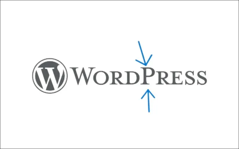
WordPress’s capital “P” is part of its creators’ official branding and naming convention.
When WordPress was first launched, the capital “P” was included to give the name a distinct, recognizable look and feel. It helps differentiate the name from other terms and gives it a unique visual identity.
This stylization has since become an integral part of the brand’s identity, and it is consistently used across the official WordPress website. Although some may refer to it informally as “wordpress,” the official spelling maintains the capital “P” as part of its brand consistency and recognition.
FAQ
Matt Mullenweg founded WordPress in 2003.
WordPress’s logo is a graphic symbol or image representing a website or brand. It’s an essential part of branding and is often displayed in the site header instead of the site title or name.
WordPress was launched in 2003 as an open-source content management system (CMS). Initially created as a blogging platform, it evolved to support various websites. Over the years, it introduced features like plugins, themes, and the ability to customize websites, contributing to its massive adoption.
WordPress.com was launched in 2005 by Matt Mullenweg through Automattic, a company he founded.
Logos can be uploaded in several file formats in WordPress, but JPEG, PNG, and SVG are the most common formats.
Conclusion
The evolution of the WordPress logo mirrors the platform’s incredible journey from a simple blogging tool to a global leader in content management systems.
Over the years, the logo has undergone subtle yet meaningful refinements, reflecting WordPress’s growth, values, and commitment to inclusivity, innovation, and community.
From its humble beginnings in 2003 to its present form, the WordPress logo is a powerful symbol of the platform’s success.
Like this post? Check out more amazing web design content here.


