Amazon is now recognized to be more than just a webstore, and is a significant influencer and driver of a plethora of technologies. What with a voice activated personal assistant, Amazon Alexa, to innovating drones in order to deliver their packages… Amazon has come a long way since their inception. With a brief but highly illustrious business history and brand design history, let us take a walk through the origins of Amazon, how the Amazon logo has played its role in the company’s endeavors.

Table of contents
What Is The History Of Amazon?
Amazon was founded by Jeff Bezos in 1994 under the name “Cadabra”. In a testament to the importance of thoughtful design & branding, though, Bezos later changed the company’s name a year later to “Amazon” after realizing that the original name has phonic resemblance to the word cadaver. At the time of its founding, Amazon only sold books. Within the first two months of being online, though, Amazon was selling books in 45 different countries and generating a revenue of $20,000 a week. The company now owns a patent on 1-click buying that it also licenses to Apple.
Check out: Pixalogo – The Best Logo Design Bundle
What started as an online bookstore has since grown into massive corporation with their hands in almost everything. From grocery shopping to cutting-edge technology, Amazon now provides everything from A to Z. It’s only fitting then that the company should have a logo that conveys this exact message.
Check out: Majestic Vector Logo Templates
What Is The Amazon Logo Meaning?
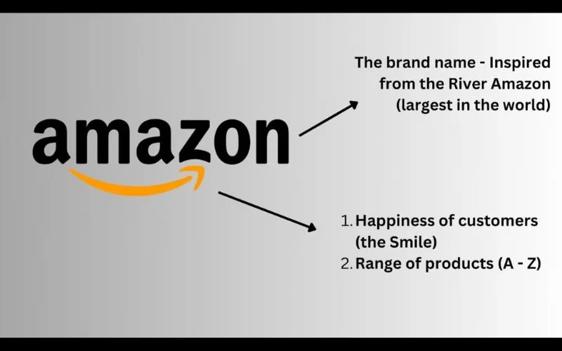
The Amazon logo is more than just a simple design – it has a cool meaning behind it! If you look closely, you’ll see a smile-shaped arrow that starts at the letter “A” and points all the way to the letter “Z.” This arrow represents how Amazon offers everything from A to Z, meaning they have just about everything you could ever need.
The smile is there to show that Amazon wants to make shopping easy and enjoyable, giving customers a positive experience. So, the logo cleverly combines both the range of products and the friendly service that Amazon is known for!
What Does The Amazon Logo Stand For?
The black color in the Amazon logo represents dominance, supremacy and elegance, while the orange color stands for pride and happiness.
The original Amazon logo meaning of the smile and arrow design was to suggest “we’re happy to deliver anything, anywhere,” but Amazon.com sent out a press release with a different meaning: “a smile now begins under the a and ends with a dimple under the z, emphasizing that Amazon.com offers anything, from A to Z, that customers may be looking to buy online.”
Check out: The Holy Grail Of Dos and Don’ts For Retro Logo Design
History Of The Amazon Logo
1995–1997
The original Amazon logo was created by Turner Duckworth in 1995 and had a stylish, symbolic design. The main feature was a bold, black letter “A,” with a smooth white line running through it, representing the Amazon River. Below the emblem, the word “amazon.com” was written in lowercase letters using a simple black sans-serif font.
1997
In 1997, the logo was redesigned with white horizontal lines that extended from the Amazon River. These lines made the logo look like not just the river, but also a tree, and even had a resemblance to a zebra pattern, making it stand out.
The color scheme remained simple, just black and white. The wordmark’s style was adjusted to be bolder, and the emblem was made smaller and more elegant.
Also read: Interactive Website Examples That Will Wow & Inspire You
1997–1998
1998 was a key year for Amazon’s logo design, with three different versions created. The first logo was a simple wordmark, “amazon.com,” written in an elegant serif font. Below it was the tagline “Earth’s Biggest Bookstore” in all caps with a basic sans-serif font. It started as a black-and-white design, but they quickly replaced it with a new one.
The next version featured a fresh color scheme of black and bright yellow. The logo had capitalized letters, with the letter ‘O’ enlarged and colored yellow. The tagline was removed in this version.
1998
The company used this logo for just a few months before replacing it with a new one at the end of the year, which later became the logo we recognize today.
1998–2000
At the end of 1998, designers created the well-known “Swish” logo. It was simple like the earlier versions but had a fresh and youthful vibe.
The logo featured the word “Amazon” in lowercase black letters, with a bright yellow line under it. The line curved slightly upward, giving the feeling of a bridge connecting the past with the future.
The word “Amazon” was in a bolder font, while the “.com” part was in a thinner style, both using the Officina Sans typeface.
Also read: Worst Logo Redesigns That Missed The Mark (and Why)
2000–2024
The Amazon logo was created in 2000 and quickly became a symbol of the tech-forward, new generation. As the world’s biggest e-commerce platform, Amazon wanted a design that reflects its positive, forward-thinking attitude.
The logo features the word “Amazon” in lowercase letters with a smooth yellow arrow underneath. This arrow starts at the “A” and points to “Z,” forming a smile, symbolizing that Amazon has everything from A to Z.
Originally, the logo featured “.com,” but Amazon dropped it as the company expanded offline. The smile-arrow, designed by Turner Duckworth, gives off a playful and friendly vibe, making the brand feel reliable and welcoming. The black and yellow color combination enhances this, creating a bright, balanced look.
The Amazon logo meaning is a great example of modern simplicity. Its clean, minimal design reflects the company’s professionalism, commitment to quality, and loyal approach to its customers.
2024 – Today
The Amazon logo was redesigned in 2024 to give it a bolder feel. The orange arrow under the black wordmark, which starts at the “A” and ends at the “Z,” became brighter and darker, making the logo look more intense and friendly. The rest of the design, including the shapes and colors, stayed the same.
What Is The Slogan Of Amazon?
“The Most Centered Company in the World” – Amazon’s slogan.
Where customers want to find and find whatever they want online, and at the lowest possible price, it will try.
In addition, the use of “Our vision is to be the most customer company, building a place where people can find and find something they might want to buy online.”
Not sure if this is an official slogan, but their corporate office is full of this motto:
“Work Hard, Have fun, Make History“
Amazon is an amazingly visionary company. This slogan reflects Amazon’s continuing aspirations to be a place where great things happen. They seek people committed to their work, passionate about what they do, and driven to achieve great things.
This is a good aspiration for any company, and the slogan is perfect for Amazon.
Check out: Beginners Guide to Business Logo Design
Parting Thoughts On Amazon Logo Meaning
The evolution of the Amazon logo is a reminder of the incredible value provided by Amazon and its employees. Many people forget the Amazon transformation brought into the books. They continue this by expanding into other goods, then selling the platform they build to succeed, and dominating THEIR market. Never turn on Kindle, Fire TV, Echo, and turn on streaming services like Amazon Video and Netflix. We cannot wait to see what Amazon brings to the table next!
Discover some cool logos and their hidden logo meanings.
Want to learn more about the Amazon company? Here are some further resources:
- The Dynamic Evolution Of Homepage Of Amazon
- The Evolution of Amazon: Amazon Logo History
- Amazon Brand Colors – Color Codes For Major Amazon Logos
- Top Amazon Storefront Examples With Stunning Designs
- How To Change Amazon Kindle Font Size
- Amazon Storefront Banner Size – Detailed Guidelines
- How To Create An Amazon Storefront
- Amazon Font Exploration: A Designer’s Guide to Versatility
Like this post? Check out more amazing web design content here.