More and more users are accessing the web through multiple devices. The mobile market continues to grow, and yet, much of the web isn’t even optimized for a mobile experience. As technologies continue to evolve, so should our approach to design. In This blog, we will learn more about responsive web design.
Table of contents
- What Is Responsive Web Design?
- Why Is Responsive Design Important?
- Tips For Responsive Web Design
- 1. Design For the User Journey, Not the Device
- 2. Use Adaptive Content That Is Prioritized Towards Context
- 3. Use Fluid Grids for Flexible Layouts That Aren’t Bound to Breakpoints
- 4. Use Consistent, Scalable Navigation
- 5. Make Use of CSS Media Queries
- 6. Use Adaptive Images for Flexible, Fluid, Fast-Loading Visuals
- 7. Use Appropriately Sized Controls for Calls-to-Action and Form Elements
- 8. Use Typography and Negative Space Effectively
- 9. Keep Load Times Low For Responsive Web Design
- 10. Run Usability Tests with the Actual Users
What Is Responsive Web Design?

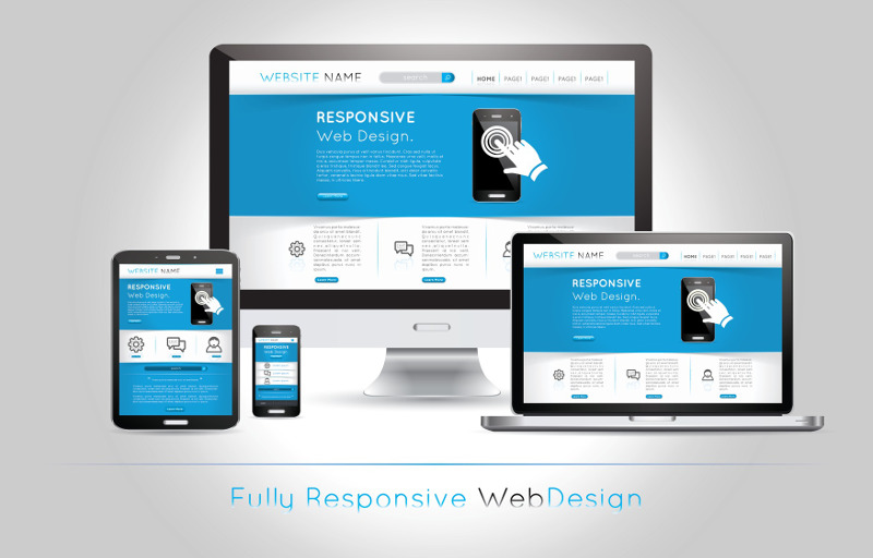
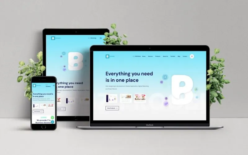
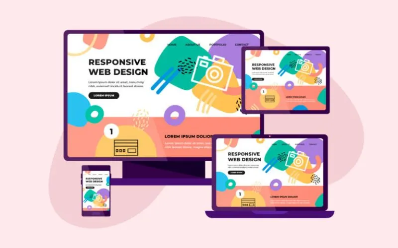
Simply put, responsive web design is a design approach meant to create a website with a layout that can adapt to any screen. In responsive web design, the same HTML is served to every device, and CSS is used to alter how the page is rendered across devices. The goal of responsive design is to give the user a seamless, optimal web experience across any device.
Elevate your web design game by exploring these must-see blogs for inspiration:
- Effective Web Design Techniques You Should Apply
- Ghost Buttons – Good Or Bad?
- Reasons Why You Should Redesign Your Website
- What Are The Qualities Of A Good Website
- How To Increase Your Visibility As A Web Designer
Why Is Responsive Design Important?
Research states that 51% of US web traffic is mobile, while desktop viewing claims only 42%. As the Internet of Things grows to encapsulate more areas of our lives, we’re very likely to be designing for someone’s television, refrigerator, or toilet, making the need for truly device-agnostic designs more important than ever.
There are also a few key benefits of implementing a responsive design:
– saves time and money over maintaining multiple versions
– increases search engine visibility
– increases user retention
– enhances the user’s experience across platforms
– increases sales and conversion rates
Fuel your web design fascination with these curated design resources.
Tips For Responsive Web Design
Many platforms and screens exist today and are sure to be ever-changing. Here’s a quick overview of 10 responsive design tips for building responsive websites that adapt regardless of the technology they’re viewed on. Let’s check out responsive web design best practices.
1. Design For the User Journey, Not the Device
Mobile may make up the majority of US web traffic, but that doesn’t mean customers will be strictly mobile or desktop. Most people still spend more time browsing on a desktop, and many users switch devices to complete tasks. It’s crucial they can do so easily, efficiently, and streamlined between experiences. Consider the how, where, and why users are accessing your content.
Also read: Slider Revolution Responsive WordPress Plugin
Check Out Design Tips That Every Startup Should Follow
2. Use Adaptive Content That Is Prioritized Towards Context
It will be much more challenging to translate a site that is meant to be everything to everybody into responsive design. Adaptive interfaces and content that adjust to the user’s needs allow for a more personalized, context-aware user experience. Thoughtful creation of user personas and managed sessions can make a truly responsive website more attainable. This design approach can also lead to more prosperous, more content-sensitive interactions.
Discover additional sources of web design inspiration by exploring these blogs:
- Why Forward and Back Navigation is Important
- Top Web Design Trends
- Why The Website Builder is Popular Today
- Necessary Elements Of A Great Website
- How to Sell Web Design Services to Small and Local Businesses
3. Use Fluid Grids for Flexible Layouts That Aren’t Bound to Breakpoints
A broken layout can compromise a website’s functionality and quickly lose customers. Fixed and adaptive layouts tend to break on screen sizes that fall outside of their designed-for window. Modular, grid-based designs use columns and define height and width values using relative proportions instead of pixels. This allows for content that rearranges itself gracefully, no matter the viewport’s size.
Also read: Best Tips For Designing Websites For Tablets
4. Use Consistent, Scalable Navigation
Navigation is one of the most important aspects of your website, but it’s also one of the trickiest to get right. Determine the appropriate context for your navigation options and follow these best practices to design effective navigation. Thoughtful, minimal content avoids the pitfalls of navigational overwhelm. Consider how you can tailor your interfaces to translate consistently between touch screens and mouse users.
Explore Tips For Designing An Effective Website Navigation
5. Make Use of CSS Media Queries
Media queries make it easy to filter how content is displayed based on the characteristics of the device rendering the content. CSS media queries allow us to alter the layout by creating rules that can be applied depending on characteristics such as screen size, resolution, display type, and orientation.
Explore these recommended blogs for a dose of web design inspiration:
- SITE123 – A Free Website Builder With No Coding Requirement
- Basic WordPress Tricks Every Designer Should Know
- How WordPress Sliders Is Going To Change Your Website Strategies
- How to design landing pages for high CTR
- WordPress Membership Plugins To Create a Subscription Site
6. Use Adaptive Images for Flexible, Fluid, Fast-Loading Visuals
Image size is the biggest hurdle to fast-loading pages and is one of the biggest culprits in broken layouts. Always optimize images for the best quality-to-size ratio and be sure to use the right file format for the job. Use CSS to scale images that will grow and shrink relative to their parent container. There are also server-side and JavaScript solutions for handling image scaling, but these can further increase page load times.
Also read: User Experience Design – Definition, Importance And Things To Know
7. Use Appropriately Sized Controls for Calls-to-Action and Form Elements
Like navigation, form elements, buttons, and other UI controls can be just as tricky to manage gracefully across devices. When considering design for these elements on smaller screens, make such elements large enough to be seen and interacted with.
8. Use Typography and Negative Space Effectively
Well-thought-out typography lets readers focus more easily and better immerse themselves in the displayed content. Use consistent color and simple font schemes across platforms as visual cues and help with readability. Pay attention to visual contrast and rhythm, effectively using negative space to separate sections and types of content.
Find more inspiration for your web design projects with these captivating blogs:
- Modern Web Application Design – Top Trends
- Elementor: The Ultimate Photography Website Builder
- Examples Of eCommerce Website Design To Get Ideas From
- Signs Of A Professional Website Design Company
- Ways Design Thinking Enhances Customer Experience
9. Keep Load Times Low For Responsive Web Design
Performance may not seem like an element of the design process, but it could be considered one of the most important, especially for mobile or low-bandwidth situations. You only have around five seconds to get a user’s attention. It won’t matter how good the layout looks if a user bounces before it gets a chance to load. To cut back on page-load times, optimize images, slim down extraneous content, and remove unnecessary scripts.
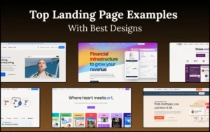
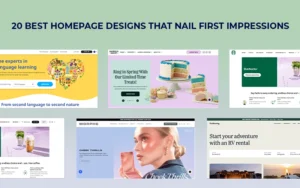
Also read: Examples of Cool Responsive Website Designs to Inspire You
10. Run Usability Tests with the Actual Users
This one may seem a no-brainer, but it can’t be stressed enough. Remember to see how your website performs in real-world applications. Test across as many use cases and device platforms as possible to ensure that every viewing experience is optimal.
Don’t forget to check out these fantastic web design tips:
- How To Optimize Your Website For Multi-Device Browsing
- Follow These Tips To Become A better Web Designer
Check out this blog to learn about best practices for website design.
Like this post? Check out more fantastic web design content here.