Let’s discuss the basics of typography. At its most basic, typography is the art of arranging type. It’s a required skill and knowledge for designers and is much more than just making words look legible.
It’s the brick-and-mortar of design used to create and shape the content on a page. Also, it’s long been used by print workers and is now vital to all types of internet commerce.
It helps the words on a page from a body and even enables understanding by those reading the work. It can include examining pixels that make up a period for the best results and may dictate how a text block will appear on the page. It’s more than experimenting with fonts or typefaces.
It’s about using typefaces and other available resources to create something sensible and robust to help the reader make decisions. Consider how a writer uses his knowledge of words and grammar to share his knowledge in a new and creative way.
Table of contents
- Typography Fundamentals: Difference Between Typeface and Fonts?
- What Are the Advantages of Choosing A Professional Font?
- What Is the Difference Between Serif and Sans Serif?
- The Importance of Alignment and Proximity
- What About Hierarchy and Scale?
- Importance Of Typography
- Typography Tips & Best Practices
- Basics of Typography – Don’t Stop Learning
It’s more than just knowledge of typefaces and fonts. A good designer must apply his creative mind to find the perfect way to display information. The choices made by a designer should also include layout and color schemes. Done correctly, they can turn a good page into a great page that draws and keeps the users’ attention.
It’s impossible to become skilled in typography unless you understand the basics of typography design. Designers must fully understand what they are doing if they need to break the rules. You can appreciate the art by visiting typography tutorials. It’s a good idea to visit Resource pages to learn about font families. You can even follow Twitter accounts to see the latest trends.
Typography Fundamentals: Difference Between Typeface and Fonts?

Let’s start by defining a typeface. Simply put, it’s a set of one or more fonts with a standard design family. It’s sometimes called a font family. But just what is a font? A font is a way an individual design is displayed.
In Johann Gutenberg’s day, letter designs were used to make molds from which metal type casts were made. Today, the word font refers to software that allows the designer to install and display the design on a digital page.
Every typeface refers to a given family of fonts. An example is the standard Serif typeface, which includes several different fonts. The best-known of which is probably the Times New Roman, much beloved by University Professors. Some people will use the words typeface and font interchangeably. It may be necessary to clarify what is meant since, technically, the words mean different things.
Learn The difference between typography and lettering
Check out: Vintage Typography Banners, Insignias & Ribbons
What Are the Advantages of Choosing A Professional Font?

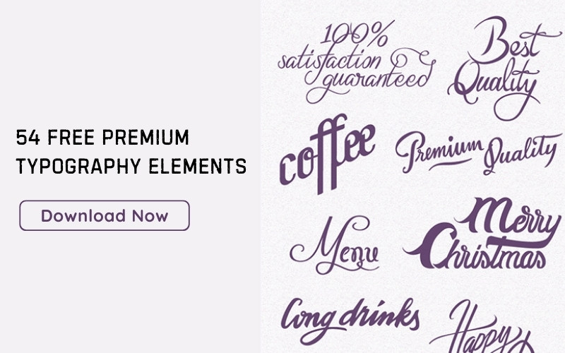
Image source: Rene Bieder
Despite the large number of free fonts on the Internet, you should remember that you don’t need all the fonts available.
Think of Leonardo Da Vinci. As an artist, he used a limited amount of colors despite an infinite number of colors available. His work did not suffer due to using just a few colors. The same is true of designers in the digital world. Too many fonts make for a messy, unpleasing display.
One option available to designers is to buy typefaces from professionals. The buyer gains certain advantages, such as the font designer’s talent and experience.
Some benefits include the availability of various weights and styles needed to form a complete family. Many also offer support for different languages by providing international characters and greater variety.
Another advantage involves kerning pairs. Kerning is the adjustment of space between pairs of letters to make them visually appealing. A kerning pair is already adjusted.
Learn how to enhance your website design with web typography.

Kerning is a great advantage because the designer cannot change the spaces manually. Kerning pairs are most often of concern in headlines and subtitles. Even if you have to pay for these fonts, they can save you both money and time.
What Is the Difference Between Serif and Sans Serif?

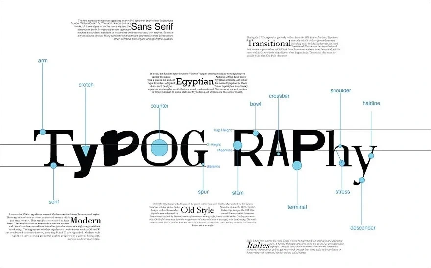
As per the basics of typography, the Serif family shows little flourishes and small blobs at the end of letters, as seen in the above example. If we remove those flourishes, we get a sans-serif font, such as the one used in the body of this article.
Check out: Serif Vs Sans Serif
Sans Serif Fonts:
Helvetica

Moon

Serif Fonts:
Jura

Atletico

It’s interesting to note that the serif font is believed to be ancient. It’s thought to have been developed by the ancient Romans. Also, it’s used mainly for the body of a text as it tends to guide the eye horizontally across a body of work, making it easier for the reader to follow the text.
Commonly used in headlines and subtitles, Sans Serif makes words stand out and catches the reader’s eye. Many websites use this combination, with headlines in Sans Serif and the body written in Serif.
Check out: The Mega Typography Bundle
The Importance of Alignment and Proximity

According to the basics of typography, alignment refers to how the text will be displayed. Usually, this is done left to right. It also shows how each block of text will line up with others. Alignment is generally done employing a grid, which is a set of vertical and horizontal lines used to strengthen a web page’s structure.
Proximity helps keep related elements closer, with enough white space between them to make it easier to read. For example, this article would be pretty daunting as a solid text block, but the white spaces between paragraphs significantly improve its readability.
Check out: Fully Editable Typography Presets with Fonts Included
What About Hierarchy and Scale?
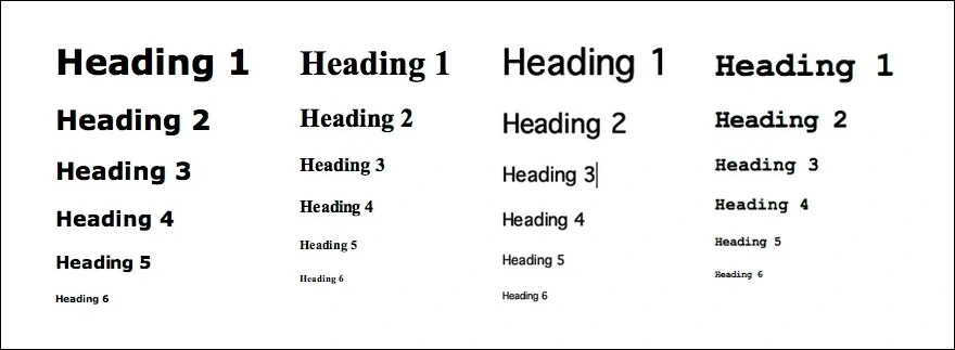
Scale becomes essential in that it helps to create a readable hierarchy. Designers often use size to emphasize the importance of elements within a body of work.
For example, headlines are often considerably more significant than the text of the work, subheadings are smaller than headlines but more significant than the text of the main body, and the text is the smallest of the three. However, you can create a hierarchy using color, layouts, and spacing, as well as by adjusting text size. Occasionally, you can use more than one element.
Importance Of Typography

Image source: Scott Prather
Typography is important because:
- The text of a design immediately draws people’s eyes. In terms of text, you can find the information you want.
- Anything that can catch the eye is usually good as long as it’s readable. Flashy isn’t as good as catchy. It may catch the eye, but many readers actively dislike flashy. They equate it with scams or non-professional work. So your goal is catchy without flash.
- On average, 90% of a design is typography. Mastering typography will increase any designer’s success.
- It Needs to Reach Readers. You must reach readers if you are to have any success. Readers can also be picky. They want what they like, and they want it now. If done right, a mixture of typography and graphics can satisfy your readers, drawing them in and keeping them engaged.
Check out: TypeZilla 2: Super Premium Handcrafted Typography Set + Bonus
Typography Tips & Best Practices
Want to master typography? We have curated a list of our blogs that will help you gain in-depth knowledge of typography and its best practices. Check out these tips and let your creativity shine!
- Best Kinetic Typography Examples And Ideas
- Typography Tips To Improve Your Website’s Legibility
- Typography Design Rules That You Should Follow
- The Best Practices For Mobile Typography
- Typography Terms That You Should Know
- The Best Strategies For Achieving Typographic Hierarchy
- Top Typographic Trends
- Hand Lettering For Beginners: Tips & Tutorials
- How To Use Large Web Typography To Stand Out
- Techniques To Improve Your Design Typography
- What Is Kerning In Typography & How To Do It Properly
Basics of Typography – Don’t Stop Learning
Today, the demand is high for designers and individuals who can proficiently work with typography. Taking the time to learn typography can help you earn the money you desire while satisfying the needs of others. The field will continue to grow, and you should be a part of it. We hope this blog covers all the basics of typography for you.
We have curated a list of resources that will elevate your typography skills.
- Beautiful Web Typography – Best Practices And Fonts To Use
- Typography Visual Hierarchy And What It Means
- Selecting A Typeface For Your Designs
- What Is An Ampersand And What Does It Mean?
Like this post? Check out more fantastic web design content here.


