When creating a graphical UI, the key features of good user interface design need to be considered. UI design best practices do not require great artistic talent—they are mostly based on the same basic elements of design that anyone can learn.

In the same way that a building requires solid foundations for its architectural design to work, user interface design practices require a strong foundation to support all its functions.
User interface design practices should always begin with drawings or tools for creating form designs. These preliminary designs should establish the relative importance of various elements and confirm precisely what controls must be featured in a familiar user interface. This upfront planning will significantly affect the end product and its usability.
Before that, let’s learn some basics of user interface design.
Table of contents
What is a User Interface Design?
Another name for UI Design is user interface engineering. This latter description makes it a little easier to understand because of the engineering term. With that in mind, the term means the design of gadgets, computers, mobile devices, machines, software applications, websites, and appliances that focus on interaction and user experience.
However, unlike traditional design, which aims to create software or a physically appealing product. The objective of UI or user interface design is to see that the user’s experience or interaction with the content produced is as simple and intuitive as possible. In other words, the design is focused on the user, or in more simple terms, it is a user-centered design. The primary difference between the two is that UI Design or User Interface Design is often invisible and subtle, while traditional graphic and industrial design is eye-catching and bold.
Check out how to leverage the power of animation in UI design.
Goals Of User Interface Design
There are two fundamental goals of UI design principles:
- To make the design effectively or emotionally acceptable, the user should have a responsibility, satisfaction, and mastery of the design.
- To make the design cognitively comprehensible – where every design element is controllable, predictable, and consistent.
What are UI Design patterns?
UI design patterns are reusable and general solutions to the typical problems that occur in the design process. Therefore, they are the elements that constitute the structure of technical support. However, since design patterns are usually applied to a wide range of circumstances, those who are tasked with the design should use them in the particular context of every design project.
There are several elements that constitute a UI Design pattern.
- Principle – a design pattern typically uses at least one design principle, such as user guidance consistency or error management.
- Examples – they demonstrate the successful application of the pattern in real-life systems. A short description or screenshot usually accompanies an example.
- Problem – this is the problem of usability when a user is using the system.
- Solution – this is the problem’s proven solution. It describes the problem’s core, and there is freedom of the designer to implement the solution in different ways.
- Implementation – implementation details are provided by some patterns.
- Why – the description of why and how the pattern works which includes the analysis of how specific usability attributes can be affected by it.
- The context of use – this describes the particular situation (with regards to the users and tasks) that causes usability issues.
Check out: KyotoUI – Landing Page Builder For Figma
What is the Difference between UX and UI?
Video source: Jesse Showalter
UI design principles is more similar to the graphic design in some of its elements but there are more complexities with regards to the element of responsibilities. UX Design or User Experience Design is more concerned about the analytical and technical aspect of the design. Although these two design systems usually work together and are both critical to the design of a product, the roles they play in the design discipline and the design process is very different.
UI Design Principles
There is a need for designers to be predictable and consistent in their choice of User Interface components. The basic interface elements are the following:
- Input Controls – these include radio buttons, checkboxes, list boxes, dropdown lists, toggles, text fields, buttons, the date field
- Informational Components – these include icons, tooltips, notifications, progress bar, modal windows, message boxes
- Containers – accordion
- Navigational Components – these include a slider, breadcrumb, pagination, search field, tags slider, icon
Elevate your UI design prowess with the help of these User Interface Design archives
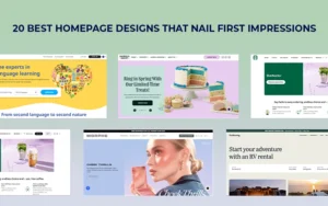
Design Considerations

Image source: Ludmila Shevchenko
The major design factors for creating a good user interface are visibility, development, and acceptance.
Visibility is what gives a website or an app its identity. It requires consideration of user responses and abilities and a clear conceptual model.
Development depends on customizability and platform constraints. Considerations for development should include factors such as support for rapid prototyping, component libraries, and toolkits.
Acceptance factors include such elements as training and documentation, international markets and corporate policies.
Empower your design journey with these expertly selected resources:
- How To Create A Familiar User Interface Design For The Users
- Reasons To Choose Vue.Js For Web UI Development
- UI Design Tips To Create A Great Web User Interface
UI Design Principles

Image source: Ramil Derogongun
The best practices for UI design involve the three basic elements of visible language:
- Communication
- Economization
- Organization
Communication relies on matching the presentation of the interface to the capability of its intended users. Economization is about making the UI design perform with the minimum number of cues. Organization means that the design will provide users with a clear structure that is consistent with its basic concept.
Check out: Website.Inc AI – No code Website Builder
Level up your design skills with these carefully curated resources:
- How To Use UI Patterns In Your Design
- UI Design Principles And Guidelines
- Most Common Design Portfolio Mistakes to Avoid
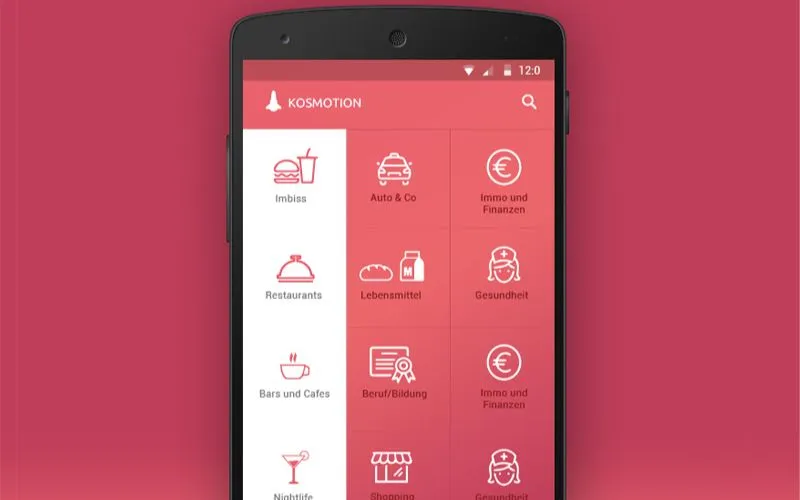
Visual Chunking

Image source: Ramotion
Visual chunking presents a tidy appearance through the visual separation of functions on an interface. The functionality of each chunk will be different from those from which it is separated. This allows users to quickly identify a specific part of the screen with a particular function or task.
Three chunks of productivity that don’t generally share functionality are:
1. A canvas: This can display to users the present state of a project they are working on.
2. A sidebar: This can feature different sections or thumbnails, which will allow users to arrive at a specific part of a project or application.
3. A toolbar: This can allow users to select or change their options, or to use the best editing tools for a project they are working on.
Learn How Visual Content Is Dominating the Online Marketplace
Color

Image source: Alexander Judin
Colors and color combinations are great aids to visual communication, and the correct use of color will provide some of the most important visual features of a good user interface.
Color is an aid to learning because we have a better ability to remember color information than we do to recall what was presented in black and white. Other advantages of effective color include:
- Visual comprehension
- Emphasis and highlighting of important data
- Making graphics appear more natural
- Reducing errors in visual interpretation
- Increasing visual appeal
- Adding dimensions and making things appear more credible
Certain color combinations may have a discomforting effect, and some can have negative cultural associations.
Check out: Website Speedy- Boost Your Website’s Performance

Other disadvantages to using color are that it will not be effective for users who are color-blind or have defective vision and that color can cause afterimages. It also requires more complex and expensive display equipment than black and white
Use of White Space

Image source: Dejan Markovic
White space does not always have to be white. It is a technical term that refers simply to blank space around and between individual fields or controls.
White space has great value in user interface design practices because the spacing makes it easier for users to identify different features of good user interface design. Spacing prevents it from having a cluttered appearance and puts more emphasis on individual controls and fields on the interface.
In the same way that text and images are arranged in newspaper columns and on the pages on a magazine, an interface is easier to view and to use when it has the spacing that is balanced and consistent.
White space should be balanced between the horizontal and the vertical elements, and be consistent between individual controls or fields. As a result, the interface will be better-looking interface and provide easier usability.
Respect the Device

Image source: Anton Aheichanka
In user interface design practices, the way people view content, share it and interact with it, through different devices is also given consideration.
When making design decisions, it is essential to consider the many types of the device users could employ to access the interface. Each type of device will have its own input method, screen size, and shape. Some people will view the interface on a horizontal screen while others may use it on a vertical touchscreen.
For use on a horizontal screen, different elements need to be placed alongside each other. For an application that is going to be used on vertical screens, these need to appear on top of each other.
Check out: MWT-200 Multipurpose Website Templates Kit
Choosing The Correct Font

Image source: Michael Martinho
Fonts should be clearly readable on all types of screen, with various resolutions, so choosing the right fonts is an important part of user interface design practices.
A decorative font is hard to read in a small point size. The best one to choose for viewing on any type and size of the screen will be one of the simplest serif and sans-serif fonts.
If a system employed by a device does not specify a particular font, it will make an automatic substitution and the result could appear very different. This is why it is best to choose one of the standard Windows fonts.
When designing apps or sites that are to be used in different languages, it is important to remember that in some languages the text strings are going to be expanded and could take up as much as fifty percent more space.
Remove Clutter, not Features

Image source: Vitaliy Zamedyanskiy
It will often be necessary to integrate a big number of features on a single interface, and this can result in it becoming too cluttered. The solution is to consider using a drop-down menu, tabs or another way of displaying only the most helpful information and tools at any one time.
While it is important for a design to be kept as simple as possible, the average user will not choose an application only on how simple it looks. Generally, an app will be selected because a user is looking for something that will perform a particular function.
UI Prototyping
Are you interested in delving deeper into the world of UI prototyping? Explore our carefully curated collection of blogs, where you’ll find a plethora of valuable insights and tips to enhance your skills in designing user interfaces.
- What Is Prototyping In Design
- Wireframes Vs Prototypes: What’s The Difference
- Micro Interactions – What They Are And How They Work
- Paper Prototyping : How To Create Prototypes On Paper
- Prototyping And Its Pitfalls
- All You Need To Know About Rapid Prototyping
- The Difference Between High And Low Fidelity Prototypes
Mobile UI Designing
Want to learn about designing for mobile phones? Explore our list of carefully chosen blogs to find plenty of tips and ideas for designing user interfaces on mobile devices. These blogs are full of helpful information that will inspire you as you create designs for phones and tablets.
- Designing For Mobile
- Why material design is taking over Android
- Top Things to Plan for When Developing a Mobile App
- How to integrate an app’s UI into a marketing strategy
- A Step-By-Step Mobile App UI Process
- Why You Need A Mobile E-commerce Strategy
- Trends That Will Dominate App Design
- Designing Apps For iOS Or Android – What You Need To Know First
To Sum It Up – UI Design Principles

Image source: James Alonso
1. According to UI design principles, an interface needs to be made consistent and should be kept clean by separating different areas of functionality.
2. Different devices have weak points and strengths that need to be analyzed and exploited to work to the user’s advantage.
3. Features are what people look for when choosing an application and it is more important to retain all the features while reducing some of the clutter.
The basic features of good user interface design are not always easily accomplished, but they do save a lot of time and expense for developers, designers, and clients.
Always consider the user when making design decisions. The ultimate aim is to design an interface that will be usable, based on strong visual elements which long-term users find convenient to use.
The best practices for UI design provide the best experience for users, so it is very important to understand and follow these basic requirements. They provide a solid foundation for a successful user interface.
Checkout What Is The Future Of User Interface Design
Credit for featured image: Goran Ramljak