What is a clean website? Clean is a term we meet every time we read about web design, but what does clean actually refer to? One thing is for sure – creating clean websites doesn’t mean inventing a whole new white nuance or brushing dust below the footer. Let’s see what it actually means and how it can be defined.

Table of contents
- What does ‘Clean Design’ stand for?
- The ‘Less is More’ principle for clean website designs
- Focus on the content for a clean web design
- Stay neutral
- Pixel-perfected details
- The importance of white space
- Get rid of elements you don’t absolutely need
- Layouts For Clean Website
- Spacing
- Use graphics that have a strong effect
- Consistency
- Keep focus on usability
- How To Design Different Web Pages
- Further Resources: Inspiration For Web Designers
What does ‘Clean Design’ stand for?
 Image source: Nathan Riley
Designers around the world are continuously impressed by beautiful and clean websites, even if most of them can’t really round-up what clean means in the case, or interpret it in their own way whenever it is discussed across their communities. Finding an example of clean design won’t be difficult, and would most probably take us to the first professional, easy to spot and easy to understand website.
Still, there are many underlying principles of clean web design we need to understand in order to replicate this clean look and use it for its real purpose.
Dive into our treasure trove of blogs to uncover fresh web design ideas.
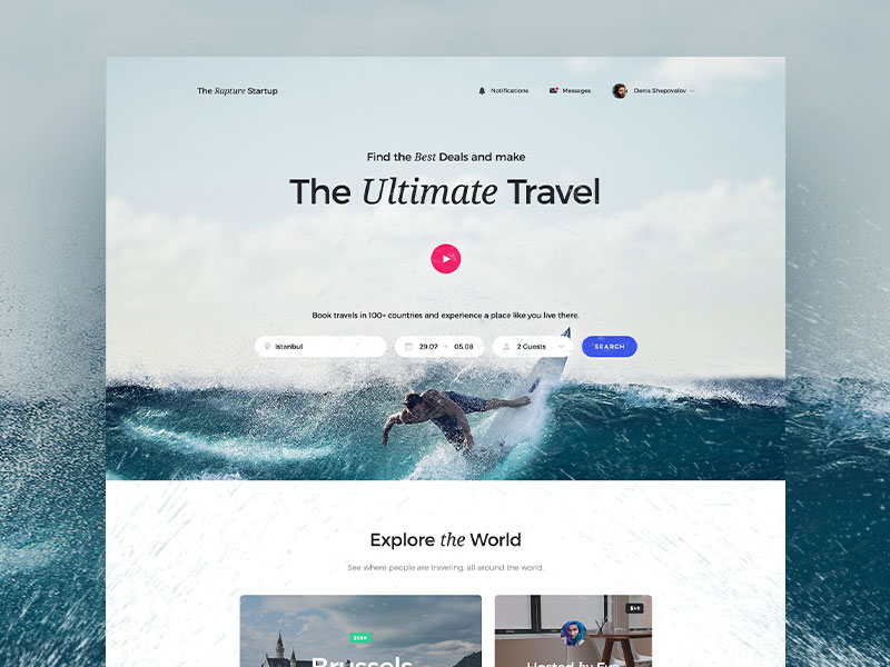
 Image source: Denis Shepovalov
Expand your creative horizons with these handpicked blogs for web design inspiration:
- Should You Use Self-Hosted Or Embedded Videos
- How To Design Websites That Are Accessible By The Disabled
- How Limitations In Web Design Can Help Your Creativity
- What Are Pastel Colors
- The Rise Of Split Screen Web Design Trend
Clean website designs are meant to promote our business, but in order to allow them to do it we need to understand what clean means in the web design context. Cleanness in the case derives from meticulous refinement, and adopts the minimalism functionality to improve both visual and styling choices.
Staying clean doesn’t mean we have to minimize the use of content, but to streamline that content in order to optimize users’ engagement and experience.
When building original websites that are clean and simple, you should take care of every component separately, and consider even the tiniest details, such as layouts, spacing, graphics, white spaces, and so on. Information should simply run with a clear and intuitive flow, and every visitor should be presented with it in a concise way, free of whatever limitation or navigation frustration.
Check out: Landing Page Templates Bundle
The ‘Less is More’ principle for clean website designs
 Image source: Charlie Isslander
Minimalism wouldn’t do without this principle, otherwise designs would be considered to be viable. Bloated and overdone designs that contain a lot of elements simply don’t make sense, and they won’t help your business stand out of the crowd.
At the same time, this doesn’t indicate that you need to remove half of your elements – just try to organize them in a logical way. Saying something short but powerful will always be better than saying a lot of unconnected things.
Check out How To Create A Great Dark Website Design
Focus on the content for a clean web design
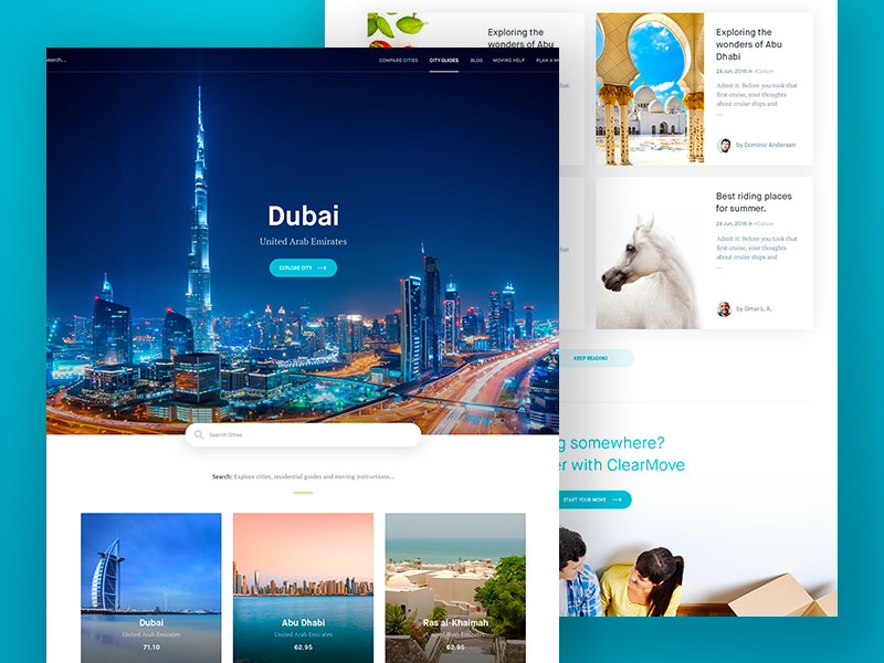 Image source: Balkan Brothers
It is all about content! To you as a designer, this means that you have to choose clean and readable fonts. And make sure they look good with the rest of our content. Luckily, the Internet offers a variety of free and beautiful fonts to choose from.
Check Out How Create A Non-Profit Website Design
Stay neutral
By this, we don’t mean you have to deprive the clean modern website design from its personality completely, but rather that you have to make content accessible instead of adding plenty of it. The content has to make sense to the visitor, and be presented in a graphically perfected manner to help people find what they came for without any obstructions.
Learn How To Convince Your Clients To Redesign Website
Pixel-perfected details
 Image source: Mik Skuza
The devil is in the details, and clean minimalist website is no exception from the rule. You have to drill deep in order to make your website cleaner, meaning that you need pixel-perfect execution of all elements, and paying specific attention even to things you used to undermine, such as borders, shadows, highlights, textures, and so on. Long story short, think of everything!
Another thing to be taken into account here is precision, because the dreadful half-pixels can genuinely cause serious damage to your website. Most of the time, this is a Photoshop mistake which happens when the edges and lines of shapes don’t line up on the pixel as they should, and the shape appears blurred on the final version of the product.
Find more inspiration for your web design projects with these captivating blogs:
- How To Use Large Background Images In Web Design
- Choose The Perfect Creative Agency
- How To Use Color Efficiently In Web Design
- Common Misconceptions About Web Designers
- Important Things Worth Considering When Designing A Website
Check out: Mobile App UI Kits Bundle
The importance of white space
 Image source: Paresh Khatri
White spaces are the next elements that can make or break your design. Because white (just as it does in real terms) removes clutter and help the minimalist approach towards a clean website. Therefore, don’t be afraid to implement them, and use them as fill-up elements wherever possible. It is exactly white spaces that help users digest your content, and this is something every successful designer can confirm.
Get rid of elements you don’t absolutely need
If it doesn’t perform a vital function, remove it. Those dozens of colorful graphics, large descriptions, and extensive sets of emoticons are cluttering your website without any need. And they decrease the visibility of what is really important.
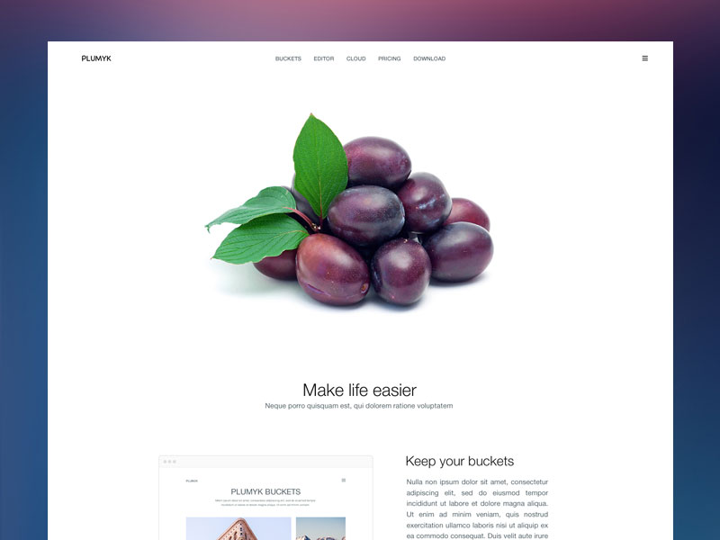 Image source: Erik Messaki
Therefore, rethink the substance of your website and its main function, and make a list of elements that add value to that substance. Everything that doesn’t appear on the list should be eradicated straight away. Still, make sure you know what you’re deleting, because there are important graphical and configuration components that affect the readability of your website, and should therefore not be removed.
Layouts For Clean Website
Grid layouts are our basic recommendation for every website. Because they keep alignments simple, streamlined, and consistent, and they prevent users from being distracted by sections jutting into each other, or alignment changes that cause sidebar sizes to vary.
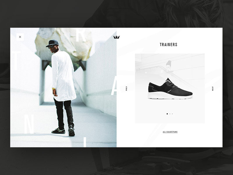 Image source: Ruslan Siiz
Their overall impression may be disconnected. And they are more than likely to associate what they see with what your company is doing. For this reason, try to organize content sections and align them the best way you can.
Unlock new avenues of inspiration with these curated blogs for web design enthusiasts:
- Why Website Design Is More Than Visuals
- Designs That Invoke Emotions: Why Do We Need Them
- Learning About Proximity In Web Design
- Create A Killer Website Redesign Project Plan
- Why You Must Design With Your Developer
Spacing
This is more common sense than recommendation. But we still feel the need to alert you that clean design oughtn’t to look cluttered in any way. Use spacing appropriately, and avoid mess.
Check out: Essential Web Design Bundle For All The WordPress Ninjas
Use graphics that have a strong effect
 Image source: Denis Shepovalov
When using graphics on cleanly designed websites, don’t go over the line with your artistic efforts, and keep them consistent. Graphic wisdom has a lot to contribute to clean web design, if planned accordingly. Put all your ideas in one place, and choose not more than a couple of images that can convey them.
Meanwhile, make sure you’ve chosen images with strong impact, ideally emotionally connected to the message you’re trying to send. Whatever it takes, don’t let them compromise the content and the minimalist navigation path.
Check out What Is A Favicon And How To Generate One?
Consistency
 Image source: Spline
Consistency is the crown of all clean design efforts. Referring to the fact that all minimalist website pages have to remind of each other, either with the header, footer, fonts, colors, images, or any other element. The most important consistency factor is probably color, both when it comes to the background and the main buttons.
Dive into these insightful blogs for a wealth of web design inspiration:
- How To Handle A Web Design Client With A Small Budget
- The Best Free Social Media Icons Sets For Your Web Design
- Great Examples Of Creative Illustration Styles In Web Design
- One Page Website Designs You Need To See
- Here’s Why You Should Use Eye Candy Color Palette
Check Out What Is Parallax Scrolling
Keep focus on usability
What really matters to your success is whether the visitor can use your website for his actions or not. While it is always a good idea to keep design neat, simple, and stylish, one shouldn’t allow appearances to compromise quality navigation.
Don’t forget to check out these amazing web design resources:
Check out: Wunder UI- Design System & UI Kit
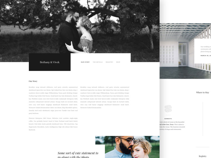 Image source: Vivek Venkatraman
The way things are now, navigation leaves a lot to be desired. Just keep in mind what people are used to see, as for instance top and left-side navigation menus. Don’t confuse them with patterns they’ve never used.
You’re only allowed to reinvent the wheel if you come up with a simple solution for your homepage that can be applied to the entire clean website without having to on-board visitors about it.
Keep in mind that there is a reason for standard solutions to be called like this. You will never be able to satisfy every visitor out there, but satisfying the majority is already a success.
How To Design Different Web Pages
Are you curious about designing various types of web pages? Take a look at our special list of blogs. They’re filled with ideas to help you get inspired when designing different web pages.
- How To Create A Good FAQ Page
- How To Design Business Web Apps
- How To Design A Good About Page
- How To Create A Great Portfolio
Further Resources: Inspiration For Web Designers
- How To Become A Successful Web Designer
- How To Land More Freelance Web Design Work
- How To Become A Good Web Designer
- How To Create The Best Photography Website
- Should Web Designers Know How To Code
Like this post? Check out more amazing web design content here.