Within the span of just a few years, the aspect of minimalist web design concepts has become increasingly popular thanks to the many different websites that showcase this basic philosophy.
Minimalism in web design has been known to feature a “signal-to-noise” ratio that is considered to be the highest possible. But there are many individuals who are unsure as to exactly what this means.

When it comes to various types of design, the term “noise” refers to anything that can distract someone from completing their main goal.

Image source: Tiep Nguyen
This means that if a website contains a lot of different design elements, it can prevent someone from having a great overall user experience.
Table of contents
- Simpler Is Not Always Easier
- How to Achieve Minimalism
- How Do You Begin the Minimalist Page Design Process?
- The Pros And Cons Of Minimalist Design
- Minimalist web page design is all about basic necessities
- The fact that it is modern doesn’t mean that it is good for you
- Advantages of minimalist design
- The disadvantages of minimalist design
- Principles Of Minimalist Web Page Design
- What Does Minimal Mean?
- Key Components of Minimalist Web Page Design
- Symmetrical Design
- Types of Visual Symmetry
- Web Designing Trends & Tips
- Web Designing For E-Commerce Websites
- Mobile Website Design
- Ending thoughts – Minimalist Web Page Design
- Showcase of Amazing Minimalist Website Examples
Simpler Is Not Always Easier
Image Source: Kevin McCutcheon
Just because various minimalist web page design principles may sound simple, that doesn’t mean that they actually are. You will still have to provide the same amount of usability with less of an interface, despite the fact that there are not many elements at all.
Dive into our treasure trove of blogs to uncover fresh web design ideas
There are generally four different things that define minimalist web page design:
- Visual Hierarchy
- Focus
- Space
- Typography
Check out: Essential Web Design Bundle For All The WordPress Ninjas
How to Achieve Minimalism

Image source: Simon Goetz
The simple answer to this question is the following: minimalism is best achieved when a design is reduced to only the elements that are absolutely essential for it.
Various minimalistic expressions span various disciplines and art forms. However, in terms of web design, minimalism can be something that is difficult for designers to fully master.
Check out this blog to learn about best practices for website design.

At the same time, it is straightforward for virtually anyone to master this concept. All that is required is to learn how to break things down into the elements necessary for a design to function fully.
In simpler terms, you need only remove things until nothing else can be removed without disturbing the design’s overall purpose.
Explore these recommended blogs for a dose of web design inspiration:
- Color Schemes For Websites, Colors Combinations And Their Importance
- The Difference Between Web Designers And Developers
- Optimizing Images For Websites
- Parallax Effect In Web Design
- Importance Of Wireframes In Web Design
- How You Should Design Web Forms
How Do You Begin the Minimalist Page Design Process?
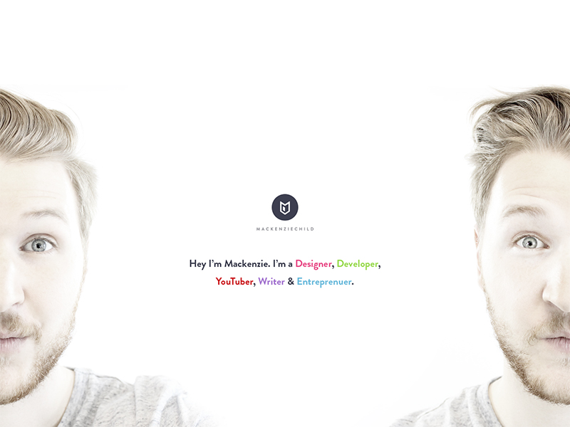
Image Source: Mackenzie Child
Define your website’s overall purpose: In order to prevent any kind of confusion, it is absolutely essential that you come up with a very clear purpose for your website. In simpler terms, determine precisely the primary use of your website.
Are you looking to display awesome & stunning photos? Perhaps you prefer to share all of the latest world news? Or maybe you would like to open your own online store? You MUST clearly define the purpose of your website, regardless of your intention.
Always remember that less is more: At some point in your lifetime, you’ve probably heard someone use the phrase “less is more”. This is absolutely essential when it comes to minimalist web page design.
The best way to achieve this, as mentioned before, is to utilize only the elements that are essential to your overall design concept.
Image source: Dmitriev Sergey
Negative space is a positive thing: Perhaps the biggest design element in the minimalist web page design style is the use of negative space. To be more specific, plenty of negative space.
Many people generally view the minimalistic web design style as being one that contains a small visual image that is surrounded by a vast amount of colorless negative space.
This could actually not be further from the truth. In fact, artists use many different colors, avoiding any texture. Aside from color, there are some designers who prefer to use elegant & high-resolution backgrounds that are white, black or any kind of dark color.
As a general rule of thumb, when there is more negative space on an object, there is an increased chance that the eye will be drawn to the visual itself. This is one thing that makes the minimalistic web design style a powerful one.
In addition, plenty of negative space also allows for various elements to be organized in a rather comprehensive fashion. This is something that can prevent a user becoming too overwhelmed visually.
Check out: Bootstrap Admin Templates For A Responsive Dashboard

Image source: Hoang Nguyen
Photography that is large and vivid: Large and vivid photography is something that can really help drive a minimalistic look while, at the same time, not dominating too much of the negative space required for the design itself.
Hero headers and hero images, two of the most common features in minimalistic web design, are generally defined by sliders or images that are often placed near the top of the website’s scroll. Photographs can also establish settings and a connection that is both atmospheric and emotional, all while keeping with the minimalist style.
The one thing to remember with any photograph is that whichever ones you select should always contain all of the visual minimalist characteristics. If they do not, you will lose your overall advantage.
Image source: Mark Anthony
Never sacrifice usability in favor of visual flair: You should always give signals to all of your users by utilizing different colors or any other kind of visual cue. Whitespace as a sculpting tool is the perfect way to create as much room as possible for various elements, provided you do not go too completely crazy with this option.
In addition, all labels should always appear on hover if you have icons that are representing your website’s overall navigation aspect.
The user should not always know where they are so that they can reach their desired destination, but they should also be able to read everything about it, which means that you should always utilize a typeface that is both clear and easy to read.

Image Source: Adrien Rochet
Keep out anything that is truly not needed: As previously mentioned, you will only want to include aspects on your website that are absolutely essential for the design to be successful.
Keep only these particular things in mind, disregarding anything else that does not truly contribute to the overall function of your website and its design.
Always keep hierarchy in mind: If you have many different websites, you will have literally only a few short seconds to both convey your main message to a user and show them exactly where they need to go.
Elements should consist of different weights and sizes in order to create an acceptable path, which generally ends in a “call to action” area.
The bottom line is that website users always feel comfortable when they know exactly where they’re going. If for some reason they fail to do so, this can cause them to become frustrated or angry.
Check out: Wunder UI- Design System & UI Kit
The Pros And Cons Of Minimalist Design
The focus of contemporary marketing and web design lies entirely on customers, meaning that you have to know and understand their needs in order to provide the best service possible.
Before rushing to follow a trend, however, you should make a research on your customers, and try to understand whether the trend is suitable for their needs. One of the trends you’ll fill strongly tempted to follow is minimalist web page design. Before you fall for it, consider the pros and cons of minimalist design.
Minimalist web page design is all about basic necessities
 Image source: James Alonso
If you’re planning to build a minimal website, have in mind that you’ll have to exclude many buttons, apps, text, or additional options that reinforce functionality. What stays, in the end, has to be essential, namely the features your website could not function without.
Get ready to arrive at the point where you have nothing to remove anymore without affecting the basic appearance/functionality of your website. Deciding on the essentials is your task only, and you have to think which the genuine parts that can make the website shine even when all distractions and decorative elements have fallen away.
The fact that it is modern doesn’t mean that it is good for you
Think about it: you’re running a robust brand that needs to be popularized with highly graphical solutions, and appear rich with images and videos. How could it possibly benefit from a minimal design solution? You may think it can, but that’s not what your target audience thinks.
Think of your objectives and your audience, and decide which type of web design is the best for you. Plan goals in advance, and share them with expert developers that can suggest the best ideas.
 Image source: Hoa Nguyen
A small hint from our side is to recommend the minimalist web page design to e-commerce site runners, as an asset that works hand-by-hand with leads and sales. When a person is trying to purchase something online, he appreciates short loading times and streamlined navigation (online vendors lose 4 out of 10 potential customers because their page takes too long to load!).
 Image source: Wojciech Zieliński
Besides, minimalist sites look sophisticated and professional, and that’s a distinct advantage that makes people want to collaborate with you. Long story short, keeping it simple will bring 76% of users on your side, and that makes it the safest bet you’ve got.
Check out: The Ultimate Branding Templates Bundle
Advantages of minimalist design
 Image source: Victor Belinatti
Let us suggest few reasons why you should choose minimalist design:
It looks stylish. Being completely honest, people put aesthetics on the top of their list of priorities when distinguishing a good website from a great one. This was the main rationale for designers to develop this style, following the example of anthropomorphic bears and picnic baskets.
They offer easy and understandable navigation. When a visitor arrives, he feels familiar and knows where everything is located. Minimalist design keeps things simple, and that’s the first step towards a successful communication with users.
 Image source: Thomas Michel
Content comes first in minimal site design. The focus is on the minimal web page and how the page looks, and that’s expected to attract visitors’ attention before anything else does.
Loading time is faster. Remember overdone sites with hundredths of images and videos? Can you remember at least one that doesn’t take ages to load?
The central moment is accented. Let’s think of visitors’ attention as something that is laser-focused: a minimalist high-contrast background is more likely to impress them that a [page heaped with hundredths of colorful details. Compare it to a completely white room with a single red table. That’s likely to be noticed, isn’t it?
Consider browsing through these blogs for fresh web design ideas:
- Adding Personality To Your Website Designs
- Using Psychology To Get The Desired Results From Your Websites
- How To Design For Wearable Devices
- What Are The Different Web Design Patterns
- The Secrets Of Color Filters In Web Design
 Image source: Dany Rizky
The important things are visible. There is no unnecessary clutter, and that’s completely enough for visitors to perceive your website as something that is authoritatively mystique.
The layout is likely to be responsive. Observed from the practical side, this is the most important reason to apply minimalist design. Think of Medium, for instance: it has only two design elements: text columns and large pictures. And that’s perfectly enough to tell the story.
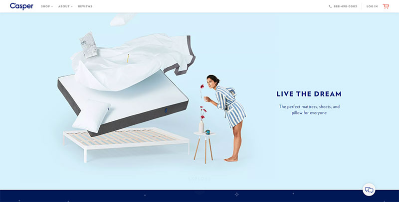 Image source: casper.com
There are no annoying ads. Tell me about a customer who wouldn’t love this, especially if he’s trying to make a quick online purchase.
The disadvantages of minimalist design
The mere concept does sound awesome, which doesn’t mean there aren’t few drawbacks you should consider.
Achieving it won’t be easy: you may think that it is very simple to make a minimalist website, but the truth is that it takes as much time as a normal site would, if not more. That’s why it doesn’t’ fit all websites, especially not those that want to cut on time and expenses.
The issue of oversaturation. When a design is minimal, even the smallest mistake can affect its reputation and tag it as being overdone. By naming a website as minimal, you’re exposing yourself to the awaken eye of critics who will be irritated by your mistakes, and you can easily see this on many blogs where people are rating minimal design in general.
Doing less than minimal. While you’re struggling to remove unnecessary issues, you’re facing the serious risk of missing some that you really need. Going too minimal can cause the site to look cheap and unfinished, and we all know how this can affect your reputation. Luckily for you, such issues can easily be handled with modest stylizing touches, such as replacing elements or adding richer content.
It will restrict you. The determined rule of how much content you’re allowed to introduce on every page can be annoying. The same counts for images and similar multimedia items you’re considering for your website.
You will always struggle to introduce extra content. In fact, with plenty of content to include, don’t even think about this solution. You won’t be able to enrich the pages without losing crucial elements, and in case you decide to divide content between pages, you’re risking to worsen the quality of your navigation (visitors don’t really like it when a product is one page, but the description is 10 pages away).
Your website will grow, and minimalist design won’t be able to grow with. The future perspective is minimalist design’s worst enemy, especially when a site undergoes dramatic changes that cannot fit into the previously established simple structure.
You will struggle to find that one element that makes you stand out. With only a few elements on board, what can be your distinctive advantage over other sites? Outstanding websites have already impressed users big time, and have raised the threshold to the point where you can hardly do whatever to surpass them. Think of the Nickelodeon logo and you will understand what we’re talking about.
Principles Of Minimalist Web Page Design
The minimalist movement was introduced to the Western design sector in the 20th century after design experts started to reduce their creations to the most basic and vital components.
Architects were the first who caught on to the movement and decided to use minimalism as a favored design approach.
There were two principles ruling the work of designers during this period: ‘less is more’ and ‘we can do more with less’.
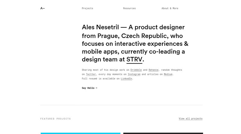
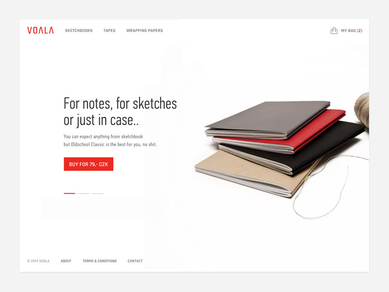 Image source: Ales Nesetril
Afterward, many designers began to create film posters, catalogs, business cards, and promotional materials using the minimalist approach.
What Does Minimal Mean?
Image source: Jake Sunshine
Designers have various opinions about what ‘minimal’ means and how minimalistic you can make a web design. There are some who believe that even inserting color into a web design takes it away from the ‘minimalist ethos’.
They think that minimal web platforms should never feature more than a handful of aesthetic components.
No matter what opinions you have about the minimalist movement and minimalist design, keep in mind that you need to strip away components and to stop when there is nothing else that can be withdrawn and still see the web design functioning as intended.
That’s why selecting design components for a web design project requires so much care and consideration.
Key Components of Minimalist Web Page Design
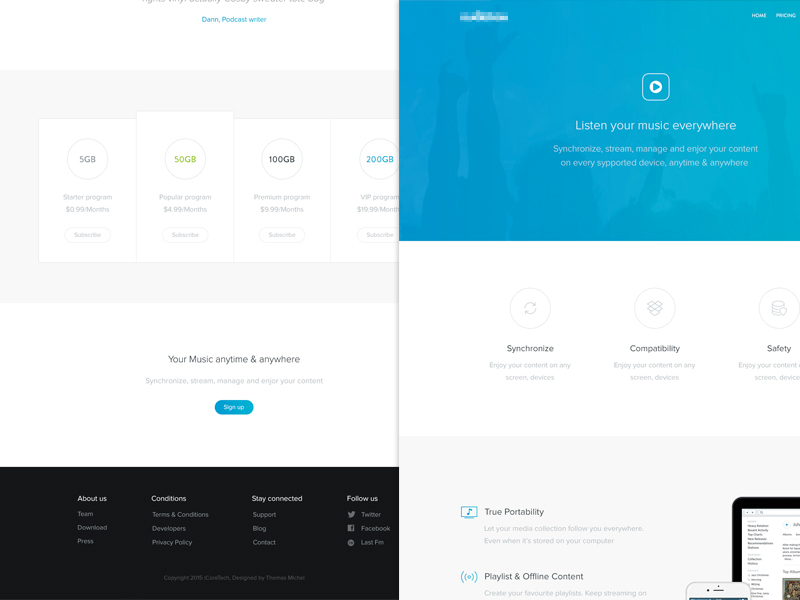 Image source: Thomas Michel
Less Content
If there is one clear and defining tenet of minimalism it is that you must only use what is vital and take away all the other components. In fact, the primary belief behind minimalist design is that the fewer components there are to interact with, the more powerful the existing ones will be.
It is important to understand that minimalism is not about a lack of resources – it is defined by a voluntary decision to take away all that it not essential.
White Space
Image source: Olly Sorsby
One of the most common components of minimalism is white space, meaning no components at all. This can also be referred to as ‘negative space’ and it is one of the most powerful tools that minimalism has to offer.
It is generally believed that the more white space there is around an item, the more easily focus will be attracted to it. Plus, white space also creates a feeling of sophistication. This is why it is so frequently used by high profile retail companies and businesses that aim to look exclusive and rare.
With the help of alignment, it becomes easier to implement the correct amount of white space and to make it simpler for visitors to interact with your website data.
Repeated Content
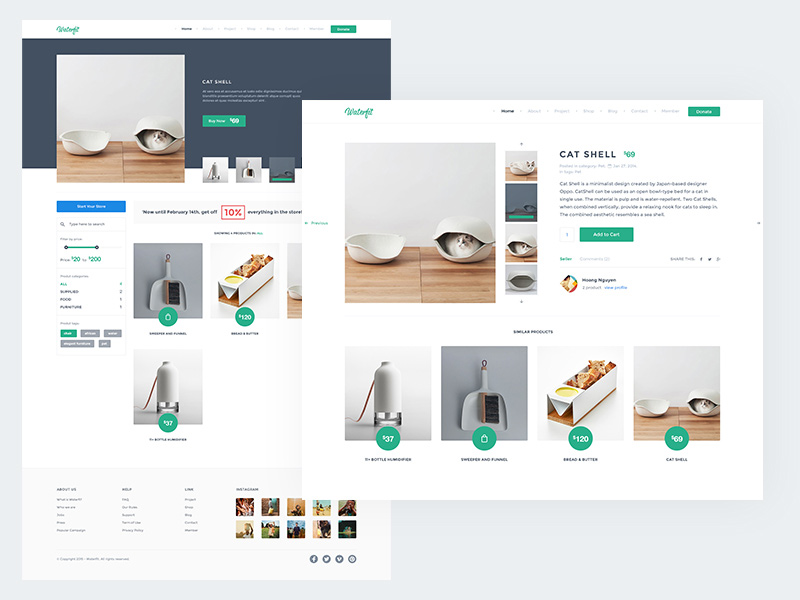
Image source: Hoang Nguyen
The repetition of content actually gives a design a feeling of fluidity and cohesiveness.
This is good news, because this technique can be used for almost all aspects of web design. It is particularly good for emphasizing shapes and symbols.
Grid Layouts
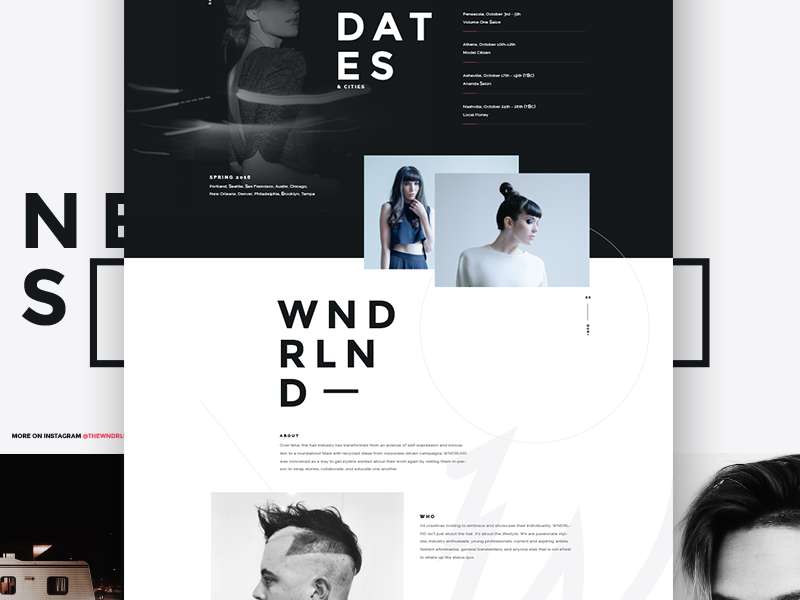
Image source: Visual Soldiers
The value of grids is that they enable minimalist web page design components to look more cohesive and ‘whole’.
As opposed to making use just of data, lines, rules, and pictures, this can be a great way to emphasis your objective. In addition, grids support design experts when it comes to fulfilling the minimalistic style with the right amount of white space.
Check out: Droidpress Premium – A Technical WordPress Magazine Theme
Symmetrical Design
Image source: Arlen McCluskey
If you want a project to be visually powerful, you must remember that it must first demonstrate visual appeal and symmetry. However, it is also possible to make a statement by intentionally disregarding this rule.
As there are fewer components with which to create the aesthetic framework, it is essential that minimalistic platforms are based on a robust system of alignment and a strong grid framework.
Thus, the fastest method is to simply ‘centre the data’, though this is not the only viable option. In some cases, the information is aligned in an ‘off centre’ fashion for a more exciting and arresting aesthetic appeal.
Designers must be familiar with various different kinds of visual symmetry and needs, in order to be able to align the big and little components within a display.
Check out: KyotoUI – Landing Page Builder For Figma
Types of Visual Symmetry
It is possible to classify visual symmetry into four types:
- Approximated – the composition is the same, but the visual weight is distributed evenly on either side of the display. For instance, one big component is evened out by a handful of littler ones.
- Half – the two sides of the display contain dissimilar layouts; these are mostly horizontal, but sometimes they are also vertical.
- Radial – begins at the middle point; the components exist in a symmetrical fashion and within an almost circular alignment.
- No Symmetry – this is planned ‘chaos,’ insofar as there is no visual pattern. It can be a very difficult style to master, but it lends a platform a very ‘dynamic’ and ‘energetic’ vibe.
Check out an example of amazing minimalist example : Cyberchimps Responsive Theme Review
Web Designing Trends & Tips
Are you interested in knowing about the latest trends in web design? Take a look at our handpicked list of blogs. They’re packed with ideas to inspire you and keep you updated on the newest trends in web design.
- Most Popular Recent Trends In Web Design
- Color Trends In Web Design
- The Trend Of Long Scrolling Websites
- The Ultimate Guide To Flat Design
- The New Visual Hierarchy Market
- What Is The Future Of Web Design
- Why You Should Follow Website Trends With Caution
- Top Web Design Trends
- Best Web Design Trends
Web Designing For E-Commerce Websites
Learn how to get the perfect web designs for e-commerce websites in these inspirational blogs:
- Generate More Leads With A High Converting Landing Page
- Credit Card Payment Forms: The Ultimate Design Guide
- How To Design A Restaurant Website
- How To Design Website Footers
- All You Need To Know About The Hamburger Menu Icon
- What You Must Do Designing A Travel Website
- How Can You Customize Your Checkout Page Design
- How To Create A Brand With Web Design
- Must-Have Elements of a Complete Ecommerce Product Page
- Ways Design Thinking Enhances Customer Experience
- The Science Behind Creating Effective Call To Action Buttons
Mobile Website Design
Are you interested in learning about designing websites for phones and tablets? Take a look at our special collection of blogs. They’re packed with ideas to inspire you when designing websites for mobile devices.
- Why You Need A Mobile Friendly Website
- Mobile Web Navigation: Best Practices
- Creating A Separate Mobile Site Vs A Responsive One
- Best Tips For Designing Websites For Tablets
Ending thoughts – Minimalist Web Page Design
 Image source: fleepbed.com
Minimal design is a great and practical solution, as long as it responds to the aesthetic, functional, and demographic needs of your business. Before you opt for it, consider the following tips:
- Test the new looks of the website before you officially commit to it.
- Implement one change at a time, so that people will feel comfortable with your updating practice (you can even include a newsfeed to avoid confusion)
- Take feedback seriously. In case you believe there is something wrong with your design, the best place to look for a solution is your users’ opinion. Ask them what they think, and include the elements they’re missing. This is what users appreciate the most.
- Remember that great design cannot replace quality marketing and outstanding customer service.
Image source: Ranjith Alingal
The bottom line is that minimalism, as a design movement, is a classic and ever popular approach to web design.
The thought of bringing a web design right down to the bare bones – free of fussy details – is one which will always appeal to design experts, even as other design trends rise and fall. If you can learn to master the above-described tenets and principles, you will never need to be concerned about keeping up with the trends.
However, it is essential that you not only boil the design down to its basic components but that you also design an even and organized layout by making use of the existing components in the right way.
Check out: Fesh – Online Store Builder
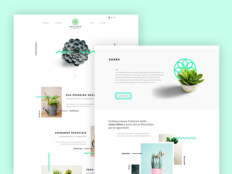
Showcase of Amazing Minimalist Website Examples
Tokyo Soup
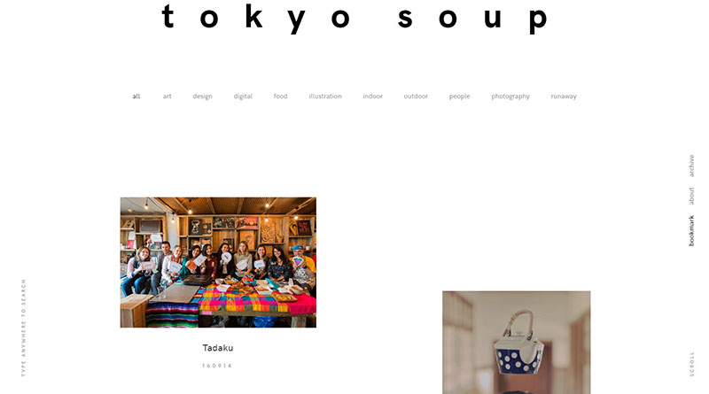
Tokyo Soup is an online visual bookmark of Japanese style, art, culture and design in general. The intention is to promote what makes Japan a wonderful place for creative-minded people, from indoor/outdoor furniture and spaces, to art and design, to the extraordinary work and lives of creatives.
etq store

Ludmilla Maury

Ales Nesetril
M.Sabai

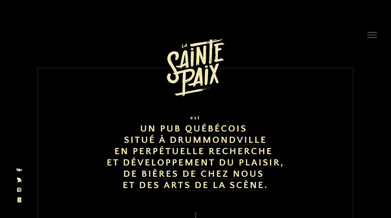
La Sainte Paix
Advantics GmbH

Henrik Larsson

Web & graphic designer.Sports enthusiast.Thinker.
Femme Fatale Studio

They are a creative studio focusing on culture, luxury, editorial & art. Somewhere between sophistication and simplicity.
Robert Levine
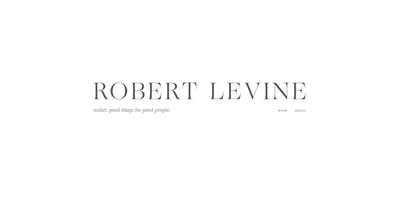
makes good things for good people.
Mindsparkle Mag
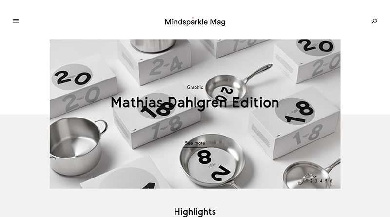
Mindsparkle is more than a high-quality online magazine. It is a platform for like-minded people sharing the same values and beliefs. Mindsparkle Mag promotes the most beautiful and inspiring projects in the fields of Design, Websites, and Videos.
Checkout: Website Speedy- Boost Your Website’s Performance
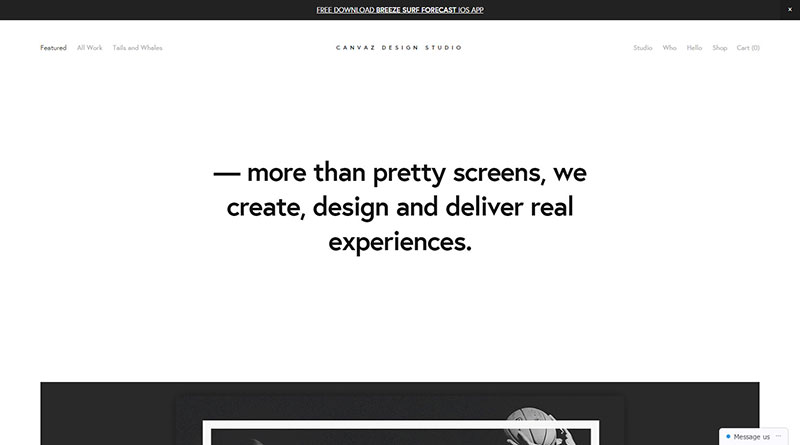
Canvaz Design Studio
Anna Kokhan

Bookhouse
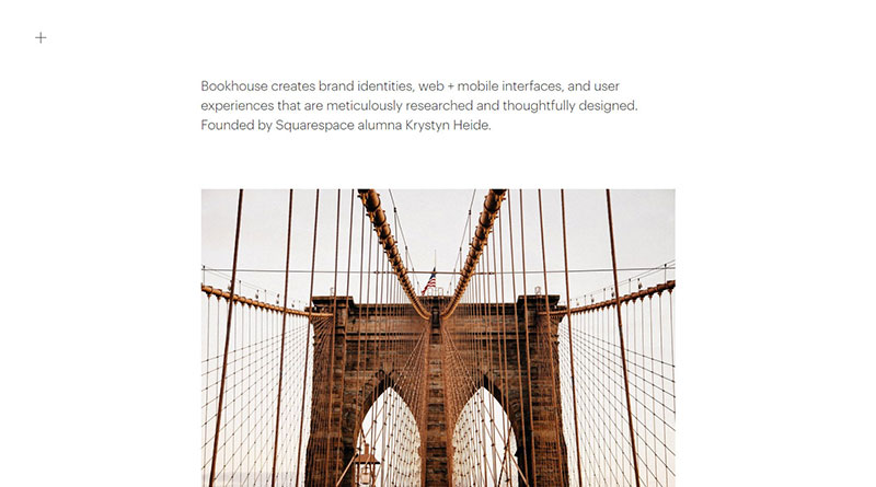
Bookhouse creates brand identities, web + mobile interfaces, and user experiences that are meticulously researched and thoughtfully designed. Founded by Squarespace alumna Krystyn Heide.
ileadfarmers
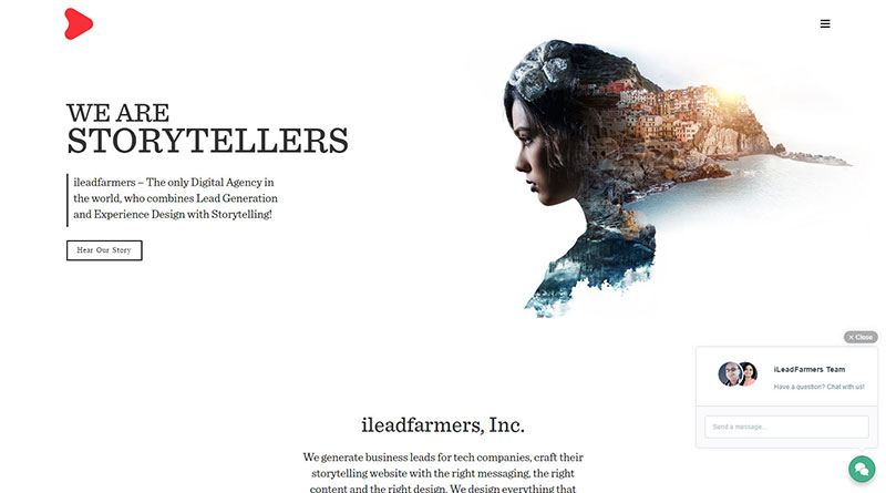
ileadfarmers – The only Digital Agency in the world, who combines Lead Generation and Experience Design with Storytelling!
totallee

They are a startup based out of South Pasadena, California and make thin iPhone cases for the stylish minimalist. When totallee began in 2013, protection for your device meant bulky, funky and overpriced.
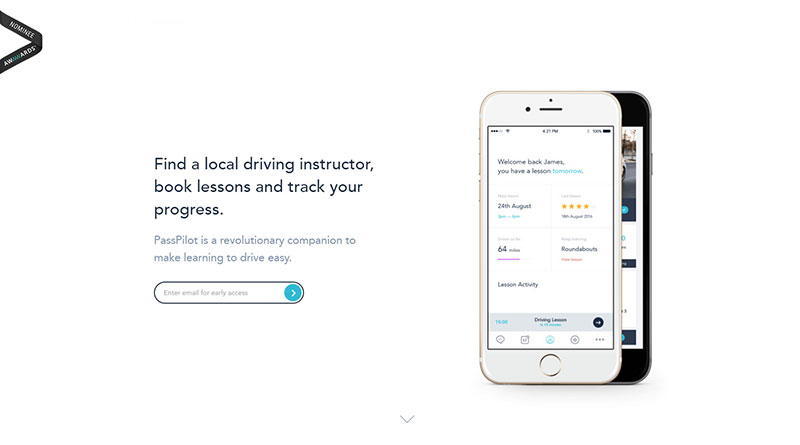
Passpilot
Yarn App

Better videos make better stories. Simple & beautiful video-editing app for iPhone.
Snake River Interiors

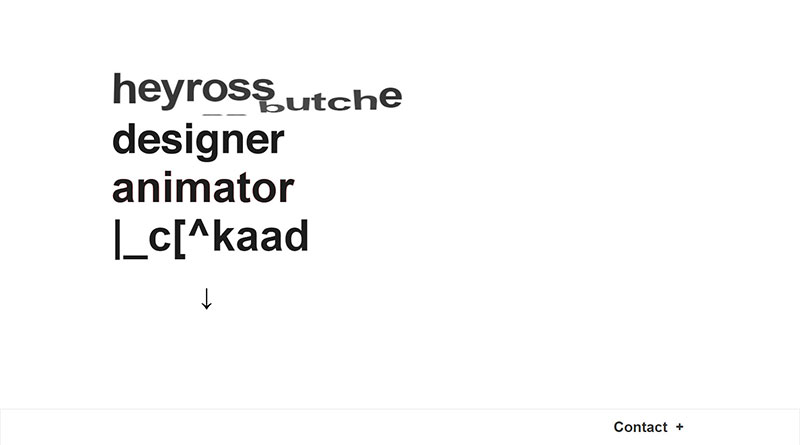
heyross
Not-studio

They are an independent digital design agency based in London who bring creativity and intelligence to the world’s most beloved brands.
Aint-bad
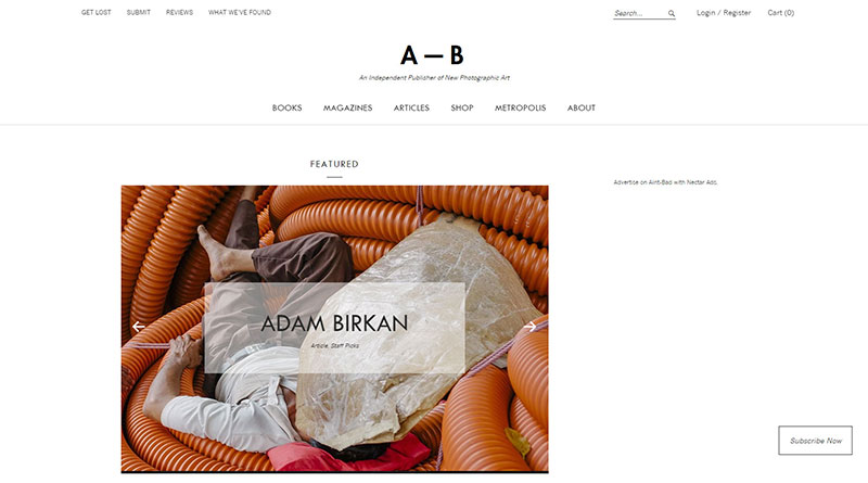
Aint–Bad is an independent publisher of new photographic art. Founded in Savannah, Georgia, the collective is dedicated to publishing contemporary photography and text to support a progressive community of artists from around the world through online web features, printed periodicals, monographs, and exhibitions.
Factorydowntown
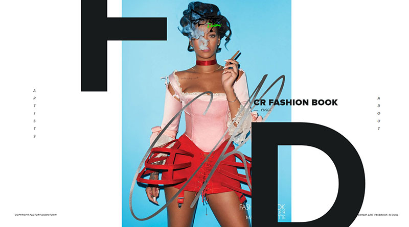
Established in 2005, Factory Downtown has since become one of the most respected artist management agencies in the world. They represent many of the most highly regarded photographers, as well as hair, makeup and wardrobe stylists for advertising, fashion, and media industries worldwide.
Prollective

If your team or agency needs someone to take care of development, or your project needs someone to deal with the whole package, they’re just who you need.
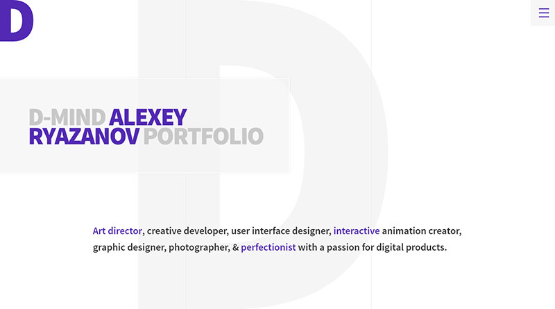
D-mind
Castor&Pollux

Jordan Sowers

Jordan Sowers is an interactive Art Director, Designer & Developer working at Instrument
scnr
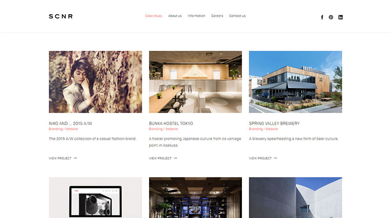
SCNR Inc. is a design firm revolving around the concept of food, clothing, and shelter that facilitates brand communication through digital media. “A life filled with sensibility” — This is what they strive to give to you.
Colm McCarthy

wearegoat
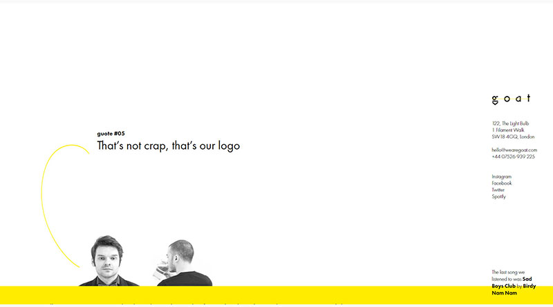
we are goat—is a London-based consultancy that focused on branding and at one point started doing web software development. The company was started by Alexey Golev and Paul Attard in 2012.
Check out: MWT-200 Multipurpose Website Templates Kit
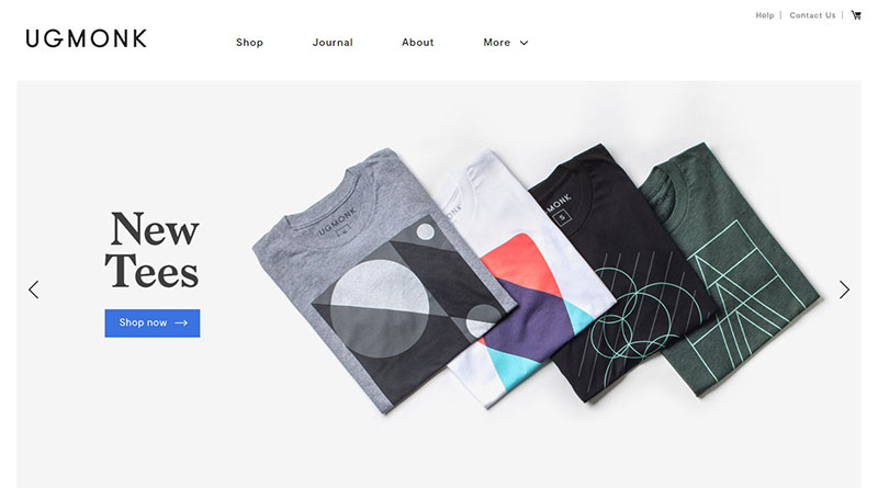
Ugmonk
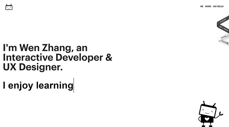
Wen Zhang
She`s an interactive developer with professional experience building efficient and scalable web applications and IOS/Android apps, currently living in New York, passionate about quality code, best practices, security, and performance.


